Category Archives: R
The R project – data analysis and visualizations in R, tutorials, nifty tricks and package recommendations.
Germany most likely to win Euro 2016
After World Cup 2014 we finally are facing the next spectacular football event now: Euro 2016. With billions of football fans spread all over the world, football still seems to be the single most popular sport. Might have something to do with the fact that football is a game of underdogs: David could beat Goliath any day. Just take a look at the marvelous story of underdog Leicester City in this year’s Premier League season. It is this high uncertainty in future match outcomes that keeps everybody excited and puzzled about the one question: who is going to win?
A question, of course, that just feels like a perfectly designed challenge for data science, with an ever increasing wealth of football match statistics and other related data that is freely available nowadays. It comes as no surprise, hence, that Euro 2016 also puts statistics and data mining into the spotlight. Next to “who is going to win?”, the second question is: “who is going to make the best forecast?”
Besides the big players of the industry, whose predictions traditionally get the most of the media attention, there also is a less known academic research group that already had remarkable success in forecasting in the past. Andreas Groll and Gunther Schauberger from Ludwig-Maximilians-University, together with Thomas Kneib from Georg-August-University, again did set out to forecast the next Euro champion, after they already were able to predict the champion of Euro 2012 and World Cup 2014 correctly.
Based on publicly available data and the gamlls R-package they built a model to forecast probabilities of win, tie and loss for any game of Euro 2016 (Actually, they even get probabilities on a more precise level with an exact number of goals for both teams. For more details on the model take a look at their preliminary technical report).
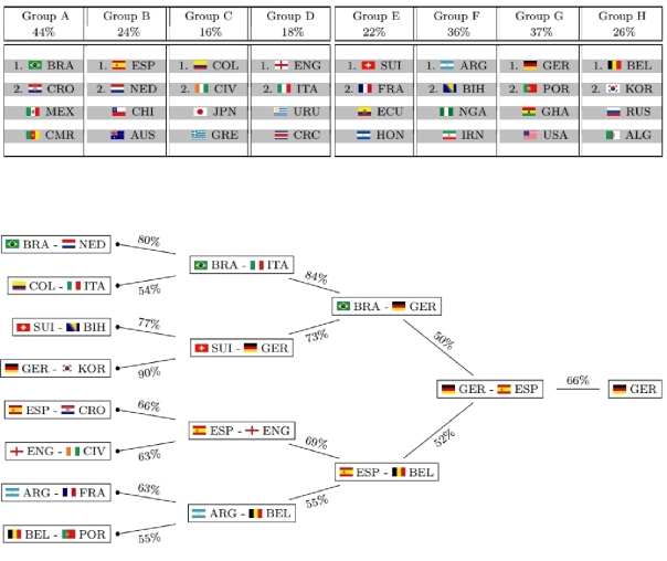
This is what their model deems as most likely tournament evolution this time:
![]()
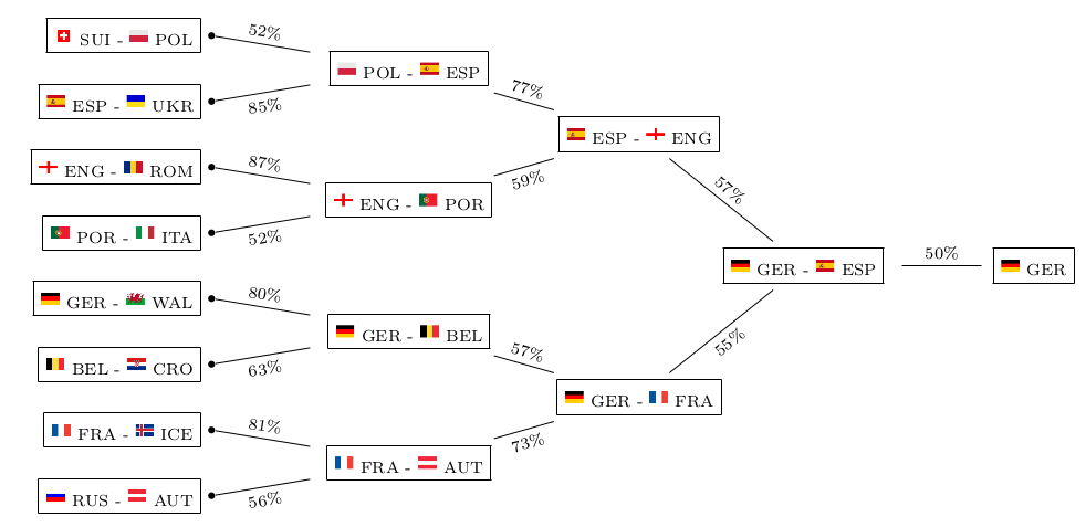
The model not only takes into account individual team strengths, but also the group constellations that were randomly drawn and also have an influence on the tournament’s outcome. This is what their model predicts as probabilities for each team and each possible achievement in the tournament:

So good news for all Germans: after already winning World Cup 2014, “Die Mannschaft” seems to be getting its hands on the next big international football title!
Well, do they? Let’s see…
Mainstream media usually only picks up on the prediction of the Euro champion – the “point forecast”, so to speak. Keep in mind that although this single outcome may well be the most likely one, it still is quite unlikely itself with a probability of 21.1% only. So from a statistical point of view, you basically should not judge the model only on grounds of whether it is able to predict the champion again, as this would require a good portion of luck, too. Just imagine the probability of the most likely champion was 30%, then getting it correctly three times in a row merely has a probability of (0.3)³=0.027 or 2.7%. So in order to really evaluate the goodness of the model you need to check its forecasting power on a number of games and see whether it consistently does a good job, or even outperforms bookmakers’ odds. Although the report does not list the probabilities for each individual game, you still can get a quite good feeling about the goodness of the model, for example, by looking at the predicted group standings and playoff participants. Just compare them to what you would have guessed yourself – who’s the better football expert?
Prediction model for the FIFA World Cup 2014
Like a last minute goal, so to speak, Andreas Groll and Gunther Schauberger of Ludwig-Maximilians-University Munich announced their predictions for the FIFA World Cup 2014 in Brazil – just hours before the opening game.
Andreas Groll, with his successful prediction of the European Championship 2012 already experienced in this field, and Gunther Schauberger did set out to predict the 2014 world cup champion based on statistical modeling techniques and R.
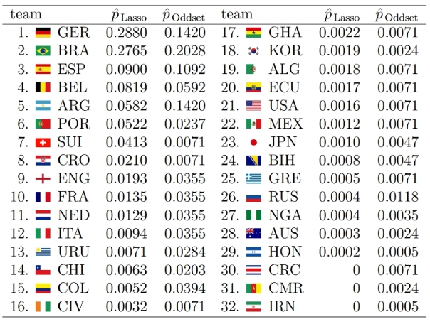
A bit surprisingly, Germany is estimated with highest probability of winning the trophy (28.80%), exceeding Brazil’s probability (the favorite according to most bookmakers) only marginally (27.65%). You can find all estimated probabilities compared to the respective odds from a German bookmaker in the graphic on their homepage (http://www.statistik.lmu.de/~schauberger/research.html), together with the most likely world cup evolution simulated from their model. The evolution also shows the neck-and-neck race between Germany and Brazil: they are predicted to meet each other in the semi-finals, where Germany’s probability of winning the game is a hair’s breadth above 50%. Although there does not exist a detailed technical report on the results yet, you still can get some insight into the model as well as the data used through a preliminary summary pdf on their homepage (http://www.statistik.lmu.de/~schauberger/WMGrollSchauberger.pdf).
Last week, I had the chance to witness a presentation of their preliminary results at the research seminar of the Department of Statistics (a home game for both), where they presented an already solid first predictive model based on the glmmLasso R package. However, continuously refining the model to the last minute, it now did receive its final touch, as they published the predictions at their homepage.
As they pointed out, statistical prediction of the world cup champion builds on two separate components. First, you need to reveal the individual team strengths – “who is best?”, so to speak. Afterwards, you need to simulate the evolution of the championship, given the actual world cup group drawings. This accounts for the fact that even quite capable teams might still miss the playoffs, given that they were drawn into a group of hard competitors.
Revealing the team strength turns out to be the hard part of the problem, as there exists no simple linear ranking for teams from best to worst. A team that might win more games on average still could have its problems with a less successful team, simply because they fail to adjust to the opponents style of play. In other words: tough tacklings and fouls could be the skillful players’ death.
Hence, Andreas Groll and Gunther Schauberger chose a quite complex approach: they determine the odds of a game through the number of goals that each team is going to score. Thereby, again, the likelihood of scoring more goals than the opponent depends on much more than just a single measure of team strength. First, the number of own goals depends on both teams’ capabilities: your own, as well as that of your opponent. As mediocre team, you score more goals against underdogs than against title aspirants. And second, your strength might be unevenly distributed across different parts of the team: your defense might be more competitive than your offensive or the other way round. As an example, although Switzerland’s overall strength is not within reach to the most capable teams, their defense during the last world cup still was such insurmountable that they did not receive a single goal (penalty shooting excluded).
The first preliminary model shown in the research seminar did seem to do a great job in revealing overall team strength already. However, subtleties as the differentiation between offensive and defense were not included yet. The final version, in contrast, now even allows such a distinction. Furthermore, the previous random effects model did build its prediction mainly on the data of past results itself, referring to explanatory co-variates only minor. Although this in no way indicates any prediction inaccuracies, one still would prefer models to have a more interpretable structure: not only knowing WHICH teams are best, but also WHY. Hence, instead of directly estimating team strength from past results, it is much nicer to have them estimated as a result of two components: the strength predicted by co-variates like FIFA rank, odds, etc, plus a small deviation found by the model through past results itself. As a side effect, the model should also become more robust against structural breaks this way: a team with very poor performance in the past now still could be classified as good if indicators of current team strength (like the number of champions league players or the current odds) hint to higher team strength.
Building on explanatory variables, however, the efficient identification of variables with true explanatory power out of a large set of possible variables is the real challenge. Hence, instead of throwing in all variables at once, their regularization approach allows to gradually extend the model by incorporating the variable with best explanatory power among all not yet included variables. This variable selection seems to me to be the big selling point of their statistical model, and with both Andreas Groll and Gunther Schauberger having prior publications in the field already, they most likely should know what they are doing.
From what I have heard, I think we can expect a technical report with more detailed analysis within the next weeks. I’m already quite excited about getting to know how large the estimated distinction between offensive and defense actually turns out to be in their model. Hopefully, we will get these results at a still early stage of the running world cup. The problem, however, is that some explanatory variables within their model could only be determined completely when all the team’s actual squads were known, and hence they could start their analysis only very shortly prior to the beginning of the world cup. Although this obviously caused some delay for their analysis, this made sure that even possible changes of team strength due to injuries could be taken into account. I am quite sure, however, that they will catch up on the delay during the next days, as I think that they are quite big football fans themselves, and hence are most likely as curious about the detailed results as we are…

Real world quantitative risk management: estimation risk and model risk
Often, when we learn about a certain quantitative model, we solely focus on deriving quantities that are implied by the model. For example, when there is a model of the insurance policy liabilities of an insurance company, usually the only issue is the derivation of the risk that is implied by the model. Implicitly, however, this is nothing else than the answer to the question: “Given that the model is correct, what is it that we can deduce from it?” One very crucial point in quantitative modeling, however, is that in reality, our model will never be completely correct!
This should not mean that quantitative models are useless. As George E. P. Box has put it: “Essentially, all models are wrong, but some are useful.” Deducing properties from wrong models, like for example value-at-risk, may still help us to get a quite good notion about the risks involved. In our measurement of risk, however, we need to take into account one additional component of risk: the risk that our model is wrong, which would make any results deducted from the model wrong as well. This risk arises from the fact that we do not have full information about the true underlying model. Ultimately, we can distinguish between three different levels of information.
First, we could know the true underlying model, and hence the true source of randomness. This way, exact realizations from the model are still random, but we know the true probabilities, and hence can perfectly estimate the risk involved. This is how the world sometimes appears to be in textbooks, when we only focus on the derivation of properties from the model, without ever reflecting about whether the model really is true. In this setting, risk assessment simply means the computation of certain quantities from a given model.
On the next level, with slightly less information, we could still know the true structure of the underlying model, while the exact parameters of the model now remain unobserved. Hence, the parameters need to be estimated from data, and the exact probabilities implied by the true underlying model will not be known. This way, we will not be able to manage risks exactly the way that we would like to, as we are forced to act on estimated probabilities instead of true ones. In turn, this additionally introduces estimation risk into the risk assessment. The actual size of estimation risk depends on the quality of data, and in principle could be eliminated through infinite sample size.
And, finally, there is the level of information that we encounter in reality: neither the structure of the model nor the parameters are known. Here, large sample sizes might help us to detect the deficiencies of our model. Still, however, we will never be able to retrieve the real true data generating process, so that we have to face an additional source of risk: model risk.
Hence, quantitative risk management is much more than just calculating some quantities from a given model. It is also about finding realistic models, assessing the uncertainty associated with unknown parameters, and validating the model structure with data. We now want to clarify the consequences of risk management under incomplete information about the underlying probabilities. Therefore, we will look at an exemplary risk management application, where we gradually loosen the assumptions towards a more realistic setting. The general setup will be such that we want to quantify the risk of an insurance company under the following simplifying assumptions:
- fix number of policy holders
- deterministic claim size
- given premium payments
Table of Contents
Quantitative Risk Management: Value-at-risk for discrete random variables
Insolvency occurs, when the total value of all assets is smaller than the value of liabilities. And, due to deviations of assets and liabilities from their expected values, any financial institution does face some risk of insolvency. It is the purpose of risk management to correctly estimate this risk, and to adjust the portfolio composition to appropriately match the company’s risk appetite. Here, we will derive the definition of value-at-risk – presumably the most important risk measure at present – and apply it to an exemplary setting with discrete random variables.

Analyzing volatility patterns for SP500 stocks
Table of Contents
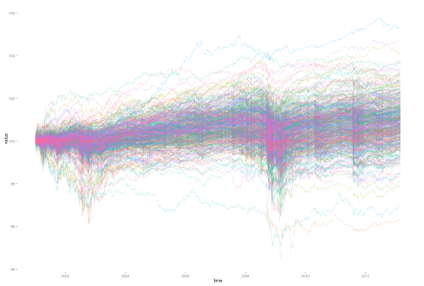
Now that we already have a cleaned high-dimensional stock return dataset at our hands, we want to use it in order to examine stock market volatility in a high-dimensional context. Thereby, we are searching for patterns in the joint evolution of individual stock volatilities. We have in mind the following goal: to reduce the high-dimensional set of individual volatilities to some low-dimensional common factors.
What we will find is that all of the assets’ volatilities seem to follow some common market trend of volatility. However, the variation explained through this market trend is about 50 percent only. Additionally, we find that, during each financial crisis, the one sector where the crisis originates will show levels of volatility above the market trend. Our sample contains two examples for this: the IT sector during the dot-com crash, and the financial sector during the financial crisis in 2008. However, based on findings of principal component analysis, there still is a large part of variation in volatilities that remains unexplained by common factors. This indicates that we should think about volatility as consisting of two parts: one part arising from common factors, and one part that is specific to the individual asset.
1 Motivation
In a portfolio context, individual asset volatility levels are probably still the most important risk factor, together with the components’ dependence structure. However, in large dimensional portfolios, it becomes extremely difficult to keep track of all of the individual volatility levels. Hence, if there was some pattern inherent in the joint evolution of volatilities, this could enable us to simplify risk management approaches through reduction of dimensionality. Whenever multiple stochastic variables show some common patterns, this is caused by dependency. And, given that this dependency is large enough, there is some redundancy in keeping track of all of the variables separately. A better way then would be to relate the components of the high-dimensional problem to some lower dimensional common factors.
So, why should there be any patterns in the joint evolution of individual volatilities? Well, as a first indication for this we can take financial crises, where usually almost every individual stock will exhibit an increased level of volatility. Slightly related to this, we later examine the explanatory power of shifts in mean market volatility. The justification for this is that usually market volatility indices react quite sensitive to financial crises, with index levels high above normal times. And, in turn, volatility indices show large dependency with mean market volatility levels. This way, mean market volatility can be seen as a proxy for financial crises.
When analyzing volatility, we are not dealing with a directly observable quantity. Hence, the first step of the analysis will be to derive some estimates for the individual asset volatility time paths. Of course, any shortcomings that we bring in at this step will directly influence the subsequent analysis. Nevertheless, we will refrain from overly sophisticated approaches for now, since we only want to get a feeling about the data first. Hence, we will derive estimates for individual stock volatilities simply by assuming a GARCH(1,1) process for each individual stock. If necessary, this assumption could easily be relaxed, and volatility paths could be estimated by different volatility models like EGARCH or some multi-dimensional extensions. Or, we could refrain from hard model assumptions, and simply estimate volatility with high-frequency data as realized volatility.
2 Estimation of volatility paths with GARCH(1,1)
As already explained, we first need to derive some estimates of the unobservable volatility evolutions over time. Hence, we will now estimate a GARCH(1,1) process with 
## clean workspace
rm(list=ls())

## load packages
library(zoo)
library(fGarch)

## read sp500 return data
z <- read.zoo(file = "data/all_sp500_clean_logRet.csv", header = T)
logRet <- coredata(z)

####################
## fit GARCH(1,1) ##
####################

## get dimensions
nAss <- length(logRet[1, ])
nObs <- length(logRet[, 1])

## preallocation
stdResid <- data.frame(matrix(data=NA, nrow=nObs, ncol=nAss))
vola <- data.frame(matrix(data=NA, nrow=nObs, ncol=nAss))

## fitting procedure
for (ii in 1:nAss) {
    ## display current iteration step
    print(ii)

    ## sometimes garchFit failed
    result <- try(gfit <- garchFit(data=logRet[, ii], cond.dist = "std"))
    if(class(result) == "try-error") {
        next
    }
    else {
        ## extract relevant information
        stdResid[, ii] <- gfit@residuals / gfit@sigma.t
        vola[, ii] <- gfit@sigma.t
    }
}

## label results
colnames(stdResid) <- colnames(logRet)
rownames(stdResid) <- index(z)
colnames(vola) <- colnames(logRet)
rownames(vola) <- index(z)

## round to five decimal places to reduce file size
stdResid <- round(stdResid, 5)
vola <- round(vola, 5)

##################
## data storage ##
##################

write.csv(stdResid, file = "data/standResid.csv", row.names=T)
write.csv(vola, file = "data/estimatedSigmas.csv", row.names=T)
3 Visualization of volatility paths
Now that we have an estimate for each asset’s volatility path, we want to get a first impression about the data through visualization. Therefore, we now will set up our workspace first, and load required data and packages.
######################
## set up workspace ##
######################

## load packages
library(zoo)
library(reshape)
library(ggplot2)
library(fitdistrplus)
library(gridExtra)
library(plyr)

## clean workspace
rm(list=ls())

## source multiplot function
source("rlib/multiplot.R")

## load cleaned logarithmic percentage returns as dataframe
logRetDf <- read.table(file = "data/all_sp500_clean_logRet.csv",
                       header = T)
names(logRetDf)[names(logRetDf) == "Index"] <- "time"

## get dimensions and dates
nObs <- nrow(logRetDf)
nAss <- ncol(logRetDf)-1
dates <- as.Date(logRetDf$time)

## load volatilities
volaDf <- read.csv(file = "data/estimatedSigmas.csv", header = T)
names(volaDf)[names(volaDf) == "X"] <- "time"
As first visualization, we now plot all volatility paths that where estimated with GARCH(1,1). Therefore, we define the function plotLinePaths, which we can reuse later on.
##############################################
## make multi-line plot of individual paths ##
##############################################

## plot multi-line path of df with column "time" or row.names
plotLinePaths <- function(data, alpha=0.2){
    "plot dataframe with or without time column"

    ## test for time column and rename if required
    if(any(colnames(data) == "time") | any(colnames(data) == "Time")){
        if(any(colnames(data) == "Time")){
            ## rename to lower case
            names(data)[names(data)=="Time"] <- "time"
        }
    }else{
        ## take row.names as x-index
        data$time <- row.names(data)
    }

    ## convert index to date format
    data$time <- as.Date(data$time)

    ## melt data to use ggplot
    dataMt <- melt(data, id.vars = "time")

    ## create plot
    p <- (ggplot(dataMt) +
          geom_line(aes(x=time, y=value, group=variable),
                    alpha = alpha))
}

## calculate mean volatility
volaOnly <- as.matrix(volaDf[, -1])
meanVola <- adply(volaOnly, .margins=1, .fun=mean)
colnames(meanVola) <- c("time", "value")
meanVola$time <- dates

plotOnly <- plotLinePaths(volaDf,0.2)

p1 <- plotOnly + xlab("time") +
    ylab("volatility")

p1 <- p1 + geom_line(mapping = aes(x=time, y=value),
                     data = meanVola,
                     color = "red")
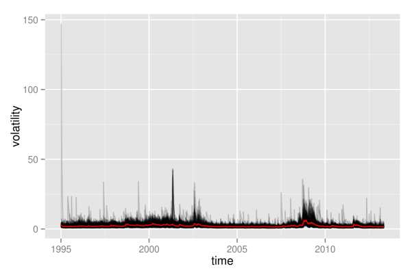
As can be seen, this graphics is not very enlightening, as the volatility paths remain in a very small interval at the bottom most of the time. Hence, we will immediately proceed by looking at logarithmic volatility paths, so that differences at the bottom will get shown in higher resolution.
#############################################
## plot log-transformation of volatilities ##
#############################################

logVola <- data.frame(time=dates, log(as.matrix(volaDf[, -1])))

p2 <- plotLinePaths(logVola, 0.2) + xlab("time") +
    ylab("logarithmic volatility") +
    geom_line(mapping = aes(x=time, y=log(value)), data = meanVola,
              color = "red")

p2
What appeared as one big black hose of nearly constant height before, now exhibits some shifts in its level over time. Clearly, times of crises do stand out from the plot: both in the aftermath of the dot-com bubble and during the financial crisis 2008, volatility paths were significantly above average levels. Even more remarkable is the fact that not only most volatility paths and their mean value are affected, but even the minimum of all volatility paths shifts significantly upwards. Hence, this is most likely not only a phenomenon that holds for most assets, but it really seems to affect all assets without exception.
Furthermore, we observe some noisy border at the top, where there are assets that individually enter high-volatility regimes in calm market periods as well. However, this also could be some artificial effect due to the estimation of volatilities with GARCH. Due to the structure of GARCH, a single large return of an asset will always automatically let its volatility estimate spike up. In contrast to the upper border, the lower border of all volatilities seems rather stable, without extreme outliers. This is at large due to the fact that volatility is bounded downwards by zero, and even the logarithmic transformation is not strong enough in order to fully compensate for this.
Still, however, even with logarithmic volatility paths, it is not possible to get more detailed insights into the individual evolutions, as they still overlap too much. This way, it is not possible to draw any conclusion of whether, for example, most paths are rather above the mean volatility, so that volatility levels would be asymmetrically distributed. Therefore, we now will take a look at the empirical quantiles of the volatilities, also. Again, we show them on normal scale, as well as on logarithmic scale.
#############################
## get empirical quantiles ##
#############################

## specify quantiles
alphas <- c(0, 0.05, 0.25, 0.5, 0.75, 0.95, 1)
nQs <- length(alphas)

## preallocation of empirical quantiles
quants <- data.frame(matrix(data=NA, nrow=nObs, ncol=nQs),
                     row.names=as.Date(dates))
names(quants) <- as.character(alphas)

## for each day get empirical quantiles
for (ii in 1:nObs) {
    quants[ii, ] <- quantile(volaDf[ii, -1], probs = alphas)
}

## process results for plotting
quantsDf <- data.frame(time=as.Date(dates), quants)
names(quantsDf) <- c("time", as.character(alphas))
logQuantsDf <- data.frame(time=as.Date(dates), log(quants))
names(logQuantsDf) <- c("time", as.character(alphas))

p3 <- plotLinePaths(quantsDf, 0.99) +
    ylab("quantiles of volatilities")

p4 <- plotLinePaths(logQuantsDf, 0.99) +
    ylab("quantiles of logarithmic volatilities")

p5 <- multiplot(p1, p2, p3, p4, cols=2)
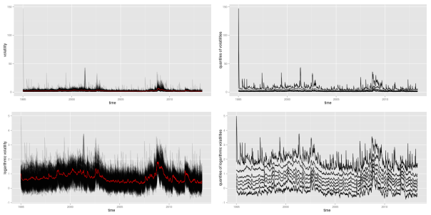
Besides the variation in height, the logarithmic quantiles look quite well-behaved and almost symmetric around the median. The symmetry only seems to fade out at the 5 and 95 percent quantiles. This could still be related to the fact that volatility, on a normal scale, is bounded from below by zero, while it is unbounded from above.
Again, the shift in height due to crises periods also becomes apparent for the empirical quantiles, and again it looks like all quantiles are affected similarly. Looking at this picture, one might be tempted to conclude that all individual volatility paths strongly follow some overall market volatility, which is represented through the median in this case. However, this conclusion is premature at this point. Even if we can get a quite good guess about the overall distribution of volatilities once we know the market volatility, it is still unsure how much this will tell us about any individual stock. We will further clarify what is meant by this in some later part.
For now, we first want to look at an at least somewhat finer resolution than the complete overall distribution of all assets. Therefore, we will split up individual assets into groups. This way, we decrease overlap of volatility paths, as the total number of paths becomes significantly lower. Hence, patterns and changes will become better visible. The division into groups that we will apply here shall follow the classification of assets provided by sector affiliation. Hence, for each of the remaining assets in our SP500 dataset, we need to determine its sector. Usually, you can access this information from any big proprietary data provider. Here, we will rely on the classification provided by Standard & Poor’s, where you can download a list of constituents for almost all sector indices. I already brought this information together in a csv file, where each of the remaining assets of our dataset is listed together with its sector. However, by the time of writing, Standard & Poor’s did not provide lists of constituents for sectors materials, telecommunication services and utilities. Hence, in the csv file, any asset that was not mentioned in one of the other sectors simply bears the label “matTelUtil”.
In order to plot volatility paths for the individual sectoral subgroups, we need to calculate the mean value of each subgroup for each day of our sample period. This task exactly matches the split-apply-combine procedure that Hadley Wickham describes in [Wickham], and that he implemented in the plyr package. Using this package, we now can easily split the data into subgroups determined by date and sector, and apply the meanValue function to each group.
## refine volatility for incorporation of sectors
volaMt <- melt(volaDf, id.vars="time")
names(volaMt) <- c("time", "symbol", "value")

## load sectors
sectors <- read.table(file="data/sectorAffiliation.csv", header=T)

## merge
volaSectorsMt <- merge(volaMt, sectors, by="symbol")
volaSectors <- volaSectorsMt[names(volaSectorsMt) != "symbol"]

## define function to get mean on each subgroup
meanValue <- function(data){
    meanValue <- mean(data$value)
}

## for each day and sector, get mean volatility
sectorVola <- ddply(.data=volaSectors,
                    .variables=c("time", "sector"), .fun=meanValue)
sectorVola$time <- as.Date(sectorVola$time)

p <- ggplot(sectorVola) + geom_line(aes(x=time, y=V1, color=sector))
p
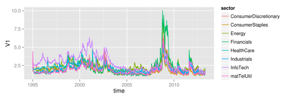
As we can see, at large, all sectors follow some joint market volatility evolution. However, there exist some slight differences over time. From 1995 until 2005, the information technology sector did exhibit the highest volatility of all sectors, while its volatility level is rather average afterwards. Then, in 2005, the energy sector temporarily becomes the sector with highest volatility, before it gets replaced again by the financial sector in 2008. Remarkably, although the financial sector exhibits large volatility in the last third of the sample, its volatility level did reside near the bottom of all sector volatilities for more than the first half. Hence, there clearly is some further variation in volatility levels besides the variation that is caused through up- and downwards shifting market volatility. The relative position of individual sectors changes over time: sectors that where beneath the market volatility in the first half, suddenly show higher levels than average in the second half. Whether this influences the explanatory power of the mean market volatility is what we want to see in the next part.
4 Explanatory power of shifting mean
So far, we have seen that there is some large variation in the level of stock volatilities during periods of market turmoil. In these periods, not only the average market volatility increases, but even the minimum of all volatilities increases. Hence, knowledge of the market volatility clearly reveals some information about the current distribution of volatilities. However, the market volatility might still reveal very little information about any given single volatility.
Let’s just assume for a second, that individual logarithmic volatilities are normally distributed around the market volatility. Then, with knowledge of the market volatility, you also know the overall distribution. However, without any further assumptions, you still do not know anything about the individual volatilities within this distribution. Any given single stock still could be anywhere around the mean, provided that it follows the probabilities determined by the normal distribution. You only know that it will be within a range with a given probability, but you still can not predict whether it is above or below the mean. Hence, without further structure, the market volatility might still be a bad estimator for any given single volatility.
However, through imposing some additional structure, one could easily extend this example into a system, where the mean of the normal distribution tells you a lot about the individual stocks as well. Let’s now additionally assume that the individual volatilities follow some ranking. Hence, the volatility of some stock A now will always be larger than the volatility of some stock B. Suddenly, we now will be able to pin down the exact location of any individual volatility very accurately. Let’s just convince ourselves of this effect with a little simulated example.
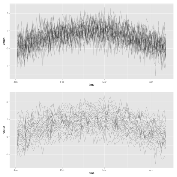
For that, we will artificially create a first increasing and then decreasing sequence of (logarithmic) market volatility levels. This can be achieved by letting the market volatility follow the first half of a sine oscillation. From this course of oscillation, we extract 100 points in time. Then, for each of the 100 points, we simulate 30 values of a normal distribution with mean value given by the market volatility sequence. This already represents the first case, where only the overall distribution is affected by the market volatility, but where still a large variation of the individual volatilities around the mean exists.
Then, for the second case, we now impose the additional requirement that individual volatilities follow a certain ranking. In order to achieve this, we simply need to sort all the simulated observations at a given point in time. Thereby, we make use of the plyr package, so that we can easily apply the sort function to each of the 100 rows of the matrix of simulated values. We then make use again of the plotLinePaths function in order to plot the resulting 30 simulated volatility paths for both cases. Clearly, the second case imposes much more structure on the evolution of joint volatilities.
library("plyr")

## init sample size and assets
nObs <- 100
nAss <- 30

## create increasing and decreasing market mean sequence
mus <- sin(1:nObs/(nObs/pi))

## specify standard deviation
sigma <- 0.5

## define simulation function
simulateForGivenMean <- function(mu){
    rnorm(n=nAss, mean=mu, sd=sigma)
}

## simulate for each mu values: individual assets in columns
simVals <- t(sapply(mus, simulateForGivenMean))
simValsDf <- data.frame(time = 1:nObs, simVals)

## for each day, sort simulated values
simValsSorted <- aaply(.data = simVals, .margins=1, .fun=sort)
simValsSortedDf <- data.frame(time = 1:nObs, simValsSorted)

p1 <- plotLinePaths(simValsDf)

p2 <- plotLinePaths(simValsSortedDf)
p3 <- multiplot(p1, p2, cols=1)
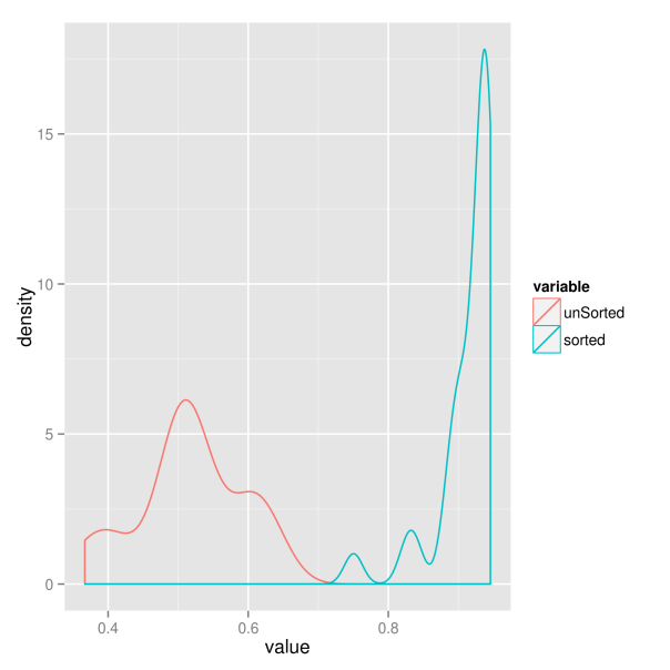
For the sake of completeness, we now additionally want to examine whether this increased structure really results in higher predictive power of the market volatility. Therefore, we extract the sample correlation between each of the simulated individual volatility paths and the market volatility. Hence, for each of the two market situations we get 30 correlations, which we compare in a kernel density plot. Clearly, the situation where volatility paths are sorted results in larger correlations. The market volatility thus will have greater explanatory power in this case.
########################################
## get correlations with market trend ##
########################################

corrs <- vector(length = nAss)
for(ii in 1:nAss){
    corrs[ii] <- cor(simVals[, ii], mus)
}

corrsSorted <- vector(length = nAss)
for(ii in 1:nAss){
    corrsSorted[ii] <- cor(simValsSorted[, ii], mus)
}

corrsDf <- data.frame(index = 1:nAss, unSorted = corrs,
                      sorted = corrsSorted)
corrsMt <- melt(corrsDf, id.vars = "index")

p <- ggplot(corrsMt) + geom_density(aes(x=value, color=variable))
p
So which of the two situations is closer to the behavior of real world markets? We will try to find out in the next part.
5 Principal component analysis
We now want to add some quantitative rigor to the qualitative analysis of the preceding parts. So far, we have narrowed our focus down to financial crises and market volatility as common underlying factors of the evolution of stock market volatilities. The reason for this is twofold. First, the relation with these factors became obvious in the first pictures of joint volatility paths. And second, they have the big advantage of being nicely interpretable. However, with the help of quantitative methods, we now have the chance to extend our search of common factors to uninterpretable factors also. Interpretable factors would only be the best case that we could hope for, and even unobservable and uninterpretable factors would be welcome in risk and asset management applications. Hence, we will now use a more general approach to check volatility paths for commonalities. And, as we will see, the market volatility will play a big role here again.
Without going too much into details, you can think of principal component analysis as a technique that tries to explain the variation of a high-dimensional dataset as efficient as possible. Therefore, you construct synthetic and uncorrelated factors (called principal components) from the original data sample. Each component is a linear combination of the original variables of the dataset. The components are calculated successively, and in each step you choose the orthogonal linear combination that explains as much of the remaining variation as possible. This way, the individual principal components will show decreasing proportions of variation that they explain. Ideally, you will end up with a situation, where most of the variation of the high-dimensional data is already explained through a small number of principal components.
For the computation of the principal components we can simply rely on the implementation of the base R package “stats”. Then, in order to see how much the high-dimensional setting boils down to some factors only, we plot the cumulated variation explained by the first components.
## get volatilities without time for PCA analysis
volaNoTime <- volaDf[, -1]

## get first two principal components
PCAresults <- princomp(x=volaNoTime)
PC1 <- PCAresults$scores[, 1]
PC2 <- PCAresults$scores[, 2]

## get cumulative proportion of variance
explainedByPCA <- summary(PCAresults)
props <- explainedByPCA$sdev^2 / sum(explainedByPCA$sdev^2)

## plot proportions of first k values
k <- 10
propsDf <- data.frame(PC=1:k, proportion=props[1:k],
                      cumulated=cumsum(props[1:k]))
propsMt <- melt(propsDf, id.vars = "PC")
p <- ggplot(propsMt, aes(x=factor(PC), y=value, fill=variable)) +
    geom_bar(position="dodge") +
    xlab("Principal Components") + ylab("proportion of variance")
p
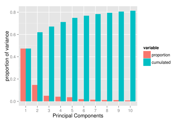
As the picture shows, the first component already explains roughly 50 percent of the total variation of the data. However, the explanatory power of the following components decreases substantially, with the second component already explaining only 15 percent of the variation. Subsequently, the next three components explain roughly 5 percent each. From the sixth component onwards the explanatory power is already so low that they probably capture already very specific variation that concerns a few assets only. And, even with 10 components, we hardly exceed a variation of 80 percent.
Hence, it looks like if the evolution of volatility paths was driven by too many different factors to be efficiently reduced to a low-dimensional system. One way we could think about this is that asset volatilities roughly do follow one, two or maybe even five common factors. However, at any point in time, there also will be a substantial number of assets that temporarily follow some individual dynamics, deviating from the larger trend. For example, even if the common factors indicate a calm market period, there still will be assets that individually exhibit stressed behavior and high volatility. Or, following a more traditional way of thinking, the evolution of a given asset is driven by two different factors: a common market factor, and an idiosyncratic, firm specific component. Sadly, the idiosyncratic components seem too large to be neglected.
Nevertheless, even though it is clear that we will not achieve the dimensionality reduction that we where striving for, we will now take a more detailed look at the first components. Maybe we can at least give them some meaningful interpretation, so that we get a feeling about when we have to expect a high average market volatility.
The first thing to do is to look at the evolution of the first two principal components. Thereby, we want to plot the path of each principal component individually, as well as the path that they follow when considered together. As ggplot does not support three-dimensional graphics yet, we will express the third dimension, time, through colors. To simplify matters, we do only map numerical indices to the color axes, instead of real dates. However, you can still read off the date-color mapping from the respective one-dimensional paths of the individual components. For reasons that will become obvious in subsequent parts, we also plot the first component with negative sign.
## scatterplot of first two PCs: first one with negative sign
pCs <- data.frame(time=1:nObs, cbind(PC1, PC2))
pCsMt <- melt(pCs, id.vars=c("PC1","PC2"))

p1 <- ggplot(pCsMt, aes(x=-PC1, y=PC2), colour=value) +
    geom_point(aes(colour=value))

## plot individual time series PC1 and PC2
pC3 <- data.frame(time=as.Date(dates), time2=1:nObs, -PC1, PC2)
names(pC3) <- c("time", "time2", "-PC1", "PC2")
pC3Mt <- melt(pC3, id.vars=c("time", "time2"))

## plot individual time series PC1 and PC2
p4 <- ggplot(pC3Mt, aes(x=time, y=value)) +
    geom_path(aes(colour=time2)) + facet_grid( variable ~ .)

grid.arrange(p1, p4, ncol=2)
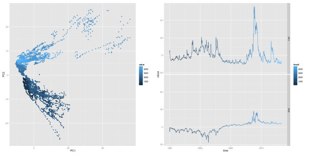
Looking at the first principal component, one should already recognize some familiar pattern: it’s peaks coincide with financial crises. As we will show later, this first principal component has an exceptional high correspondence with the market volatility. We can recognize crisis periods also in the path of the second principal component. Here, the component takes on extreme values during both financial crises, too. However, the values differ in sign for the two crises periods: the component shows negative values in the aftermath of the dot-com bubble, while it takes on positive values during the financial crisis of 2008. Hence, when considering both components together, crisis periods can be found in the upper right and lower right corners of a two-dimensional space of both components.
As the first component’s sensitivity to financial crises is equally strong as the market volatility’s sensitivity, they both should also exhibit some mutual relationship. Hence, we now want to examine the strength of the similarity between first component and market volatility. Thereby, we simply use mean and median of all volatility paths as a proxy for the market volatility. Additionally, we also allow the principal component to be linearly transformed (shifted and rescaled) to better match the path of the market volatility. We regress each market volatility proxy on the first component, in order to get a best linear transformation. Afterwards, we choose the market volatility proxy with the largest 
In order to get mean volatility and median for each given date, we again use the plyr package of Hadley Wickham. This way, we can easily split the data into subsets, and then apply a function to each part.
library("plyr")

## load volatilities
volaDf <- read.csv(file = "data/estimatedSigmas.csv", header = T)
names(volaDf)[names(volaDf) == "X"] <- "time"
volaNoTime <- volaDf[, -1]

## get first two principal components
PCAresults <- princomp(x=volaNoTime)
PC1 <- PCAresults$scores[, 1]
PC2 <- PCAresults$scores[, 2]

## get mean of volatilities as market volatility proxy
volaMatrix <- as.matrix(volaDf[, -1])
marketVola <- aaply(volaMatrix, .margins=1, .fun=mean)
marketMedian <- aaply(volaMatrix, .margins=1, .fun=median)

## apply linear rescaling according to regression coefficients
fit <- lm(marketVola ~ PC1)
fit2 <- lm(marketMedian ~ PC1)

## get r squared for both mean and median
rSquared1 <- summary(fit)$r.squared
rSquared2 <- summary(fit2)$r.squared

(sprintf("R^2 for mean=%s, R^2 for median=%s",
         round(rSquared1, 3), round(rSquared2, 3)))

pC1MarketVolaDf <- data.frame(time=dates,
                              rescaled_PC1=fit$fitted.values,
                              marketVola=marketVola)

pC1MarketVolaMt <- melt(pC1MarketVolaDf, id.vars="time")
p1 <- ggplot(pC1MarketVolaMt, aes(x=time, y=value, colour=variable)) +
    geom_line()
[1] "R^2 for mean=0.983, R^2 for median=0.966"
Comparing the
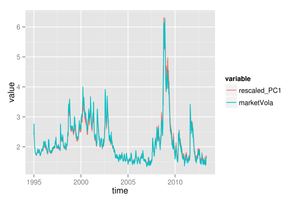
As the first principal component nearly exactly matches the market volatility, we can relate its properties to the market volatility. Hence, we now can conclude that roughly 50 percent of the variation of individual asset volatilities is explained through a general market volatility level. The rest of the variation thus arises from fluctuations around the mean, and we will try to find some explanation for this, too. First, however, we want to find out how the influence of the market volatility exactly affects the individual assets. Therefore, we need to take a more detailed look at the factor loadings, which will be distinguished according to sectoral affiliation again. As with the principal component itself, we also change the sign of its loadings, so that the graphics will be consistent, and the component becomes directly interpretable as market volatility.
While the first plot shows a histogram of the loadings in absolute terms, the second plot shows relative proportions for the individual sectors.
## get loadings for first component
loadings1 <- PCAresults$loadings[, 1]
loadDf1 <- data.frame(symbol=names(loadings1), loadings=loadings1)

## load sectors
sectors <- read.table(file="data/sectorAffiliation.csv", header=T)
loadSectorDf <- merge(loadDf1, sectors, by="symbol")

## adjust bin size to 20 bins
binw <- diff(range(loadSectorDf$loadings))/10

## colorize according to sector
p1 <- ggplot(loadSectorDf, aes(x=-loadings, fill=sector)) +
    geom_histogram(binwidth=binw) +
    xlab("loadings of 1st principal component")
p2 <- ggplot(loadSectorDf, aes(x=-loadings, fill=sector)) +
    geom_bar(position="fill", binwidth=binw) +
    xlab("loadings of 1st principal component")

multiplot(p1, p2, cols=1)
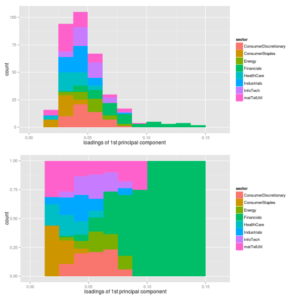
The most important point here certainly is the fact that all individual assets have a positive loading for the first component. Hence, each single asset follows the variations of the market volatility. Thereby, companies from the financial sector have loadings that are larger than average, while sectors consumer staples, health care and industrials are below average. Still, this does not directly translate into the strength of the market volatility’s influence on individual sectors. To measure this strength, we additionally regress each asset’s volatility path on the path of the first principal component, and extract the values of
## preallocation
rSquared1 <- vector(mode="logical", length=nAss)

## regress each volatility on the first principal component
for(ii in 1:nAss){
    dataDf <- data.frame(y=volaDf[, ii+1], x=PC1)
    lmFit <- lm(y~x, data=dataDf)
    temp <- summary(lmFit)
    rSquared1[ii] <- temp$r.squared
}

## plot R^2
rSquaredDf1 <- data.frame(symbol=row.names(PCAresults$loadings),
                          rSquared=rSquared1)
rSquaredSectors <- merge(rSquaredDf1, sectors, sort=F)

## adjust bin size to 10 bins
binw <- diff(range(rSquared1))/10

## colorize according to sector
p1 <- ggplot(rSquaredSectors, aes(x=rSquared, fill=sector)) +
    geom_histogram(binwidth=binw) +
    xlab("R squared for individual assets and PC1")
p2 <- ggplot(rSquaredSectors, aes(x=rSquared, fill=sector)) +
    geom_bar(position="fill", binwidth=binw) +
    xlab("R squared for individual assets and PC1")

multiplot(p1, p2, cols=1)
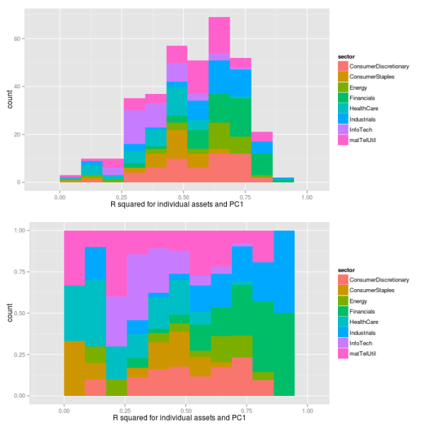
As we can see, the values of
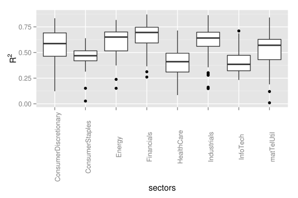
## preallocation
rSquared1 <- vector(mode="logical", length=nAss)

## regress each volatility on the first principal component
for(ii in 1:nAss){
    dataDf <- data.frame(y=volaDf[, ii+1], x=PC1)
    lmFit <- lm(y~x, data=dataDf)
    temp <- summary(lmFit)
    rSquared1[ii] <- temp$r.squared
}

## plot R^2
rSquaredDf1 <- data.frame(symbol=row.names(PCAresults$loadings),
                          rSquared=rSquared1)
rSquaredSectors <- merge(rSquaredDf1, sectors, sort=F)

## boxplot
p <- ggplot(rSquaredSectors) +
    geom_boxplot(aes(x=sector, y=rSquared)) +
    xlab("sectors") + theme(axis.text.x=element_text(angle=90)) +
    ylab(expression(R^{2}))
p
As next step, we now want to find some interpretation for the second component as well. However, the path of the second component did not immediately suggest any easy interpretation, so that we now will need to take a look at the loadings first.
## get loadings for first component
loadings2 <- PCAresults$loadings[, 2]
loadDf2 <- data.frame(symbol=names(loadings2), loadings=loadings2)

## load sectors
sectors <- read.table(file="data/sectorAffiliation.csv", header=T)
loadSectorDf <- merge(loadDf2, sectors, by="symbol")

## plot histogram of negative loadings
p <- ggplot(loadSectorDf) + geom_histogram(aes(x=-loadings,
                                               fill=sector))

## adjust bin size to 20 bins
binw <- diff(range(loadSectorDf$loadings))/10

## colorize according to sector
p1 <- ggplot(loadSectorDf, aes(x=loadings, fill=sector)) +
    geom_histogram(binwidth=binw) +
    xlab("loadings of 2nd principal component")
p2 <- ggplot(loadSectorDf, aes(x=loadings, fill=sector)) +
    geom_bar(position="fill", binwidth=binw) +
    xlab("loadings of 2nd principal component")

multiplot(p1, p2, cols=1)
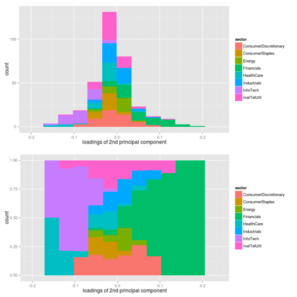
As it turns out, the loadings of the assets are almost fairly cut in halves with respect to their sign: approximately one half of the loadings has a positive sign, while the other half has a negative sign. However, this fair split does not hold for individual sectors. While financial companies nearly show a positive loading exclusively, companies from health care and information technology sectors have negative signs only. Hence, the second component picks up differences in volatility between these sectors. Let’s see, what these different signs of the loadings will actually mean for the volatilities of the sectors. Therefore, we need to look at loadings and the path of the second component simultaneously.
## evolution 2nd factor
PC2df <- data.frame(time=dates, PC2=PC2)
p2 <- ggplot(PC2df, aes(x=time, y=PC2)) + geom_line()
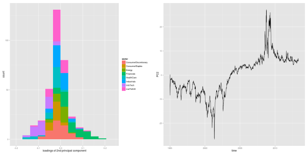
As we can see from the figure, the second principal component takes on negative values constantly for roughly the first half of the sample period, before it shifts into positive numbers until the end of the sample. Due to the loadings, a negative second component coincides with decreased volatility levels for the financial sector, and increased levels for health care and information technology sectors. This effect becomes even more pronounced during financial crises, where the component takes on its most extreme values.
In other words, the first component corresponds to the level of the market volatility, and it shifts the overall distribution of asset volatilities up and down. The second component, however, only captures changes within a given distribution. For the first half of the sample, it adds some extra volatility on the information technology sector, while it decreases the volatility of the financial sector. In the second half, it is the other way round.
To further clarify the role of the second component, we create another simulated example as visualization of this effect.
## simulate points from normal distribution
nSim <- 20
mu <- 0
xx <- rnorm(nSim, mu, 1)

## points below the mean value are listed as group1
indSign <- factor(xx<mu, levels=c("TRUE", "FALSE"),
                  labels=c("group1", "group2"))

## append points with changed sign - groups affiliation unchanged
xxDf <- data.frame(vals=c(xx,-xx),
                   time=factor(c(rep(1, nSim), rep(2, nSim)),
                       levels=c(1, 2),
                       labels=c("positive factor", "negative factor")),
                   group=rep(indSign, 2), y=rep(0,(2*nSim)))

## show points for different realizations of factor
p <- ggplot(xxDf, aes(x=vals, y=y, color=group)) + geom_point() +
    facet_grid(time ~ .) + stat_function(fun=dnorm, color="black") +
    scale_x_continuous(limits = c(-5, 5)) +
    labs(title="variation explained by PC2")
p
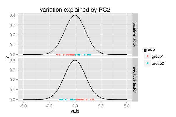
The figure shall convey the following intuition: the realization of the second component does not change the overall distribution, but it only explains variation within the distribution. Hence, for positive values, the first group of points will be located to the left, while they are located to the right for negative realizations.
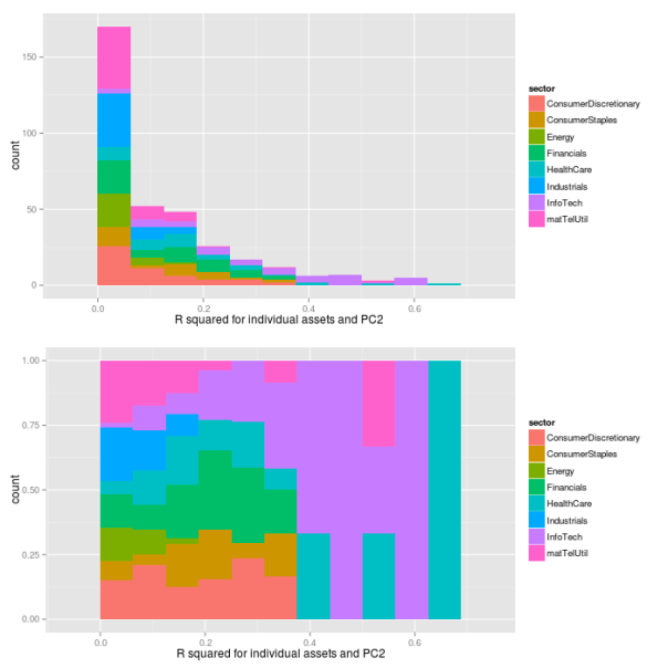
As with the first component, we now want to see how the loadings translate into real influence. Therefore, we regress each asset’s volatility path on the path of the second component, and extract the
## preallocation
rSquared2 <- vector(mode="logical", length=nAss)

## regress each volatility on the first principal component
for(ii in 1:nAss){
    dataDf <- data.frame(y=volaDf[, ii+1], x=PC2)
    lmFit <- lm(y~x, data=dataDf)
    temp <- summary(lmFit)
    rSquared2[ii] <- temp$r.squared
}

## plot R^2
rSquaredDf2 <- data.frame(symbol=row.names(PCAresults$loadings),
                          rSquared=rSquared2)
rSquaredSectors <- merge(rSquaredDf2, sectors, sort=F)

## adjust bin size to 10 bins
binw <- diff(range(rSquared2))/10

## colorize according to sector
p1 <- ggplot(rSquaredSectors, aes(x=rSquared, fill=sector)) +
    geom_histogram(binwidth=binw) +
    xlab("R squared for individual assets and PC2")
p2 <- ggplot(rSquaredSectors, aes(x=rSquared, fill=sector)) +
    geom_bar(position="fill", binwidth=binw) +
    xlab("R squared for individual assets and PC2")

multiplot(p1, p2, cols=1)
## preallocation
rSquared2 <- vector(mode="logical", length=nAss)

## regress each volatility on the first principal component
for(ii in 1:nAss){
    dataDf <- data.frame(y=volaDf[, ii+1], x=PC2)
    lmFit <- lm(y~x, data=dataDf)
    temp <- summary(lmFit)
    rSquared2[ii] <- temp$r.squared
}

## plot R^2
rSquaredDf2 <- data.frame(symbol=row.names(PCAresults$loadings),
                          rSquared=rSquared2)
rSquaredSectors <- merge(rSquaredDf2, sectors, sort=F)

## boxplot
p <- ggplot(rSquaredSectors) +
    geom_boxplot(aes(x=sector, y=rSquared)) +
    xlab("sectors") + theme(axis.text.x=element_text(angle=90)) +
    ylab(expression(R^{2}))
p
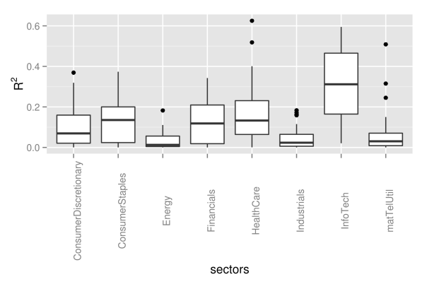
As we can see from the pictures, the influence of the second component measured by the
Now let’s try to embed these quantitative findings into a more qualitative perception that we have of the sample period, and think about their relevance for practical applications. First, the quantitative findings do match very well with the respective origins of the crises periods. During the dot-com crash, which was labeled after its origin in the IT sector, our quantitative findings also do show some enlarged volatility levels of the same sector. And, for the financial crisis of 2008, the second component assigns a higher volatility level to the financial sector, while the IT sector simply follows some more general market conditions.
6 Conclusion
How much should we rely on these findings when trying to assess future risks? Well, in my opinion, we probably should focus rather on the larger patterns pointed out by the analysis, instead of sticking too much with the details. For example, although the second component captures differences between both crises very appropriately, I would not bet too much on its predictive power in future. The point is, it overfits the exact origin of the crises, such that it mainly distinguishes between IT and financial sector. However, I’d rather focus on the bigger story that this component tells: crises may originate in one sector, which then will exhibit volatility levels above the general market trend. Nevertheless, the exact sector, where the next crisis will originate, could be any. Our data simply did contain only crises that were caused by IT and financial sector.
Another pattern that seems rather robust to me is the variation captured by the first principal component. Hence, the general market volatility is not constant over time, but it increases during crises periods. And these shifts in market volatility seem to affect many, if not all, individual assets. Besides, however, at each point in time, some individual assets will always deviate from the larger trend of volatility. Hence, there must be some idiosyncratic component to volatility, too.
References
| [Wickham(2011)] | Hadley Wickham. The split-apply-combine strategy for data analysis. Journal of Statistical Software, 400 (1):0 1-29, 4 2011. ISSN 1548-7660. URL http://www.jstatsoft.org/v40/i01. |
Presenting your findings with R
Even the best findings can be worthless to science when presented opaquely and without consideration of didactic presentation and comprehensibility. When striving for maximal understandability, standard text can be enhanced through a number of additional components: mathematical formulas, clear graphics, statistical code, interactive elements in graphics or even applications with graphical user interfaces. Luckily, for all these elements a state-of-the-art solution already exists in R. The following post shall give a short overview of promising implementations so far.
Literate programming
In the about page of this blog, I already expressed my valuation of code not only as a means to an end, but also as kind of a lingua franca for conveying knowledge in statistics. “Instead of imagining that our main task is to instruct a computer what to do, let us concentrate rather on explaining to humans what we want the computer to do.” (Donald E. Knuth) In line with this statement, knitr mingles text and code to allow dynamic report generation to html format or even LaTeX. According to the author, knitr builds on and extends the popular Sweave package. An excellent screencast on the capabilities of knitr can be found here, and you can even test knitr live through a web application with OpenCPU here. One additional striking feature is the seamless integration with RStudio and LyX, which is an exceptional graphical interface to LaTeX formula editing. For more information, see the webpage on Using knitr with LyX.
Interactive graphics
It is easy to run into situations, where labeling of graphics will fail due to the large number of components of the data. For example, when plotting a large number of stock price paths over time, labeling of individual paths will fail just due to the indistinguishability of individual path colors.
In situations like these we can gain a lot of information by providing interactivity to the graphic. With interactivity, one just needs to click on a given path of interest, and the corresponding company name, price and date will be displayed. So far I know about two great packages to enable interactivity in R graphics: googleVis and rCharts. googleVis provides an interface to access the powerful Google chart tools from within R. These charts are build on JavaScript, and can be easily embedded into any web page. The package comes with a vignette, and the author Marcus Gesmann provides some nice additional tutorials and instructions on his homepage. For some of the features you can even find tutorial videos on YouTube.
I haven’t looked too much into rCharts so far, but from the homepage we get that it is based on JavaScript as well. Hence, it seems like JavaScript is providing the richest framework for interactive graphics at present, with the most popular approaches to interactivity in R simply building interfaces to JavaScript. For a very nice example of what ultimately could be possible through interactivity in graphics, take a look at this comparison of stock market selection strategies.
Presentations in html
Sadly, creating interactive Java based graphics is only one part of the deal, as we have to face another hurdle when it comes to presentations containing such graphics. The problem is that pdf format – arguably the most common format for publications in science – does not (or only very badly) support interactive graphics. However, this is where the next enhancement comes into play: html based presentations. Meanwhile, html did catch up on two of the main requirements of the statistics related scientific community: vector graphics (through SVG) and mathematical formulas (through MathJax). Additionally, html slides also allow for text reflow, which provides much better user experience on mobile devices with small displays, as well as better embedding of media content such as interactive graphics, audio or video. If you want to see what I’m talking about, just take a short look at this example.
Now that you have seen some of the features possible with html, time for the next good news: it’s not even difficult. Dr. Ramnath Vaidyanathan, the author of rCharts, has developed another package, slidify, that let’s you easily create html slides directly from RStudio, with interactive graphics included and dynamic code blocks implemented through knitr. For further example presentations, take a look at this presentation listing some major advantages of slidify, or this presentation of a real statistical analysis presented with slidify.
However, slidify of course is not the remedy to all our problems. I haven’t tested this yet, but probably the pdf format could play more neatly with printing devices. Also, look and execution of some special features of your presentation still dependent on the actual browser used to view the slides. Using a current version of one of the main browsers (Firefox, Chrome or Internet Explorer), however, should rule out any bad surprises.
Interactive user applications
The last component that could be desirable for presenting results are standalone applications. Thereby, for example, the user could play around with different parameter settings, and hence develop a deeper understanding for a given topic, and a feeling for robustness and sensitivity of the results. Expanded with an appealing graphical user interface, such applications could also attract more interest and attention of students in academia.
One way to create such applications in R could be through usage of the package shiny, which can be used to deploy applications over the web. This way, users only need a web browser in order to be able to use the application, while the actual computation will be conducted on a server with R somewhere else. A similar approach is also followed by OpenCPU, which focuses on embedded statistical computation and reproducible research. Generally, such approaches can be used through two different strategies: either you set up your own Linux server hosting R, or you outsource the computations into the cloud, for example with Amazon web services. In order to get started, you can test your setup with a small scaled account at Amazon for free. A good tutorial on how to set up R with Amazon web services can be found here.
Putting the parts together
With rCharts and slidify, Dr. Ramnath Vaidyanathan not only created two of the main components for rich and interactive presentations. He also started the project “interactive learning environment” to get out the maximum learning experience, through nicely playing all the individual parts together. Take a look at this presentation, where he includes interactive R components in html slides, while simultaneously showing a recorded screencast of the slides, which is synced to the actual presentation.
Awesome!
Programming style guidelines: R and MATLAB
“Any fool can write code that a computer can understand. Good programmers write code that humans can understand.” (Martin Fowler)
This post addresses the issue of programming style guidelines. It highlights some of the most important recommendations found in commonly accepted sources on style guidelines, and tries to find a compromise between style conventions of R and MATLAB communities.
1 Motivation
I think one of the differences between statisticians and computer scientists is that many statisticians tend to think about coding just as a means to an end. Once equipped with theories and models, their curiosity lies with the validation of their ideas on data – no matter how this will be achieved exactly. And if pen and paper weren’t such a cumbersome method on the large data-sets of today, it probably still would be a most highly regarded approach in statistics, too.
Of course, this description of statisticians so far is quite a bit exaggerated. However, as a statistician myself, I sometimes find myself behaving very similar to what I did describe so overstated above: the data analysis part – stirring my curiosity – increasingly becomes the center of my attention, while implementation details get put further into the background. But only until I need to step through some older parts of code again, and suddenly realize, that I have problems understanding even my own code. Not to mention the effort required whenever some bug needs to be tracked down in uncommented and unstructured code. It is always in these situations that one gets a reminder on one of the most important lessons in data analysis: there is more to good coding than just coming up with a solution! What we should be striving for is producing “code that is more likely to be correct, understandable, sharable and maintainable” (Richard Johnson). Or, using the words of Martin Fowler: “Any fool can write code that a computer can understand. Good programmers write code that humans can understand.”
Against this background, I want to share some sources and recommendations about programming style conventions that I have stumbled upon so far. Thereby, I will pick up only on those conventions in more detail, where I think my own coding style requires the most improvement. Furthermore, I will also try to come up with some compromise on these recommendations, in order to guarantee a minimal consistency between the two programming languages that I use for statistical applications the most: R and MATLAB. In addition, it might be worthwhile for you to even go beyond this post and – at least once – take a look into one of the original and more elaborate programming style guidelines yourself:
R guideline resources:
R Coding Conventions by Henrik Bengtsson
MATLAB guideline resources:
2 Variable / function names
For variable and function names, I would recommend to follow a mixed case convention, starting with lowercase, such as sortMatrixColumns. I strongly discourage the use of sort.matrixcolumns in R, since a “.” is not allowed for names in MATLAB, and even in R it can be confused with the method of an object. So far, I was always using underscore to decompose names into meaningful parts (e.g. sort_matrix_columns). However, I found that both R and MATLAB style guides discourage this style – although I must admit, that I did not encounter any problems with it so far. The only drawback I could come up with is that any TeX-based interpreter could take underscore as indicator of subindices. For example, some editors like emacs might display the part after “_” slightly displaced downwards. Opposed to that, however, it is a lot easier to customize an editor to allow deletion of word parts separated by underscore. Replacing daily_returns through monthly_returns without touching the second word part requires less tweaking than for the case of dailyReturns and monthlyReturns. In other words, you can easily customize an operation “word-deletion” to only remove word parts separated by underscore gradually.
In addition, however, I originally would have liked to see some difference between function and variable names. While both can be distinguished rather easily in R and Julia, since round brackets are used for function arguments and squared brackets for variable indices, it could provide additional visual help in MATLAB, where round brackets are used for both functions and variables. Nevertheless, this is in no way common convention in any of the communities, so that I will not opt for taking this approach alone by myself.
Pluralization of variable names should be noted more clearly as through the appending of “s”. Distinguishing between date and dates is far less obvious than it is between date and dateArray. However, I must admit that I do not intend to go for the long extension with …Array, but I rather will use an abbreviation like …Arr or …Matr for …Matrix. Most style guides, however, explicitly advise to refrain from using such abbreviations.
Negated logical operators should not be used: isFound is preferred over isNotFound.
3 Comments
Most users are probably very aware of the importance of comments for the understandability of code that should be shared with others. In addition to that, comments should also comply with some minimum standards.
Important variables should be introduced and commented near the start of the file. If you initialize a variable stockReturns, you might want to give it some further explanation:
stockReturns <- matrix(NA, ncol = 200, nrow = 1000)
## captures logarithmic daily returns in percent, columns
## corresponding to individual stocks, rows to dates
The very bare minimum of any function documentation should contain one line on the function’s main task, and documentation of arguments (inputs) and returns (outputs). For example, from Google’s R Style Guide:
CalculateSampleCovariance <- function(x, y, verbose = TRUE) {
## Computes the sample covariance between two vectors.
##
## Args:
##   x: One of two vectors whose sample covariance is to be calculated.
##   y: The other vector. x and y must have the same length, greater than one,
##      with no missing values.
##   verbose: If TRUE, prints sample covariance; if not, not. Default is TRUE.
##
## Returns:
##   The sample covariance between x and y.
Also, if the function implies any side effects (actions besides its output: plotting, printing, creating files), these need to be mentioned in its description.
4 Control Flow
R: “If” statements should have a white space in front of the condition, and the “else” part should be surrounded with braces:
if (condition) {
  one or more lines
} else {
  one or more lines
}
MATLAB: “switch” variables should always be a string. Furthermore, any switch block should include an otherwise expression that captures all remaining cases:
switch switch_expression
   case case_expression
      statements
   case case_expression
      statements
    :
   otherwise
      statements
end
Also, end lines in MATLAB can have comments.
5 White space
R: The google style guidelines advise placing spaces around all binary operators (=, +, -, <-). The only exception could be spaces around “=” when it refers to passing arguments in a function call. Commas should always be followed by space, while you never should put a space in front of a comma.
MATLAB: Logical operators like “=”, “&” and “|” should always be surrounded by white spaces. Conventional operators and commas generally could be followed by spaces. In my opinion, this is something that usually provides additional clarity, so that I tend to use spaces most of the time. Especially for the case of commas, I stick with the same behavior that is recommended in the R style guidelines.
6 Errors
Errors should be raised with stop() in R.
7 Summary
Like I said, this list is far from being exhaustive, and mainly captures the conventions that were unknown to me so far. There are a lot of additional conventions in the original sources which I find very helpful and recommendable. In order to see which points deserve the most importance in MATLAB according to my opinion, you could also take a look at my annotated version of Richard Johnson’s MATLAB Programming Style Guidelines.

Downloading SP500 stock price data with R
1 Summary
In this blog post I want to show how to download data of all constituents of the S&P500 index, which is one of the leading stock market indices for US equity, from Yahoo!Finance. According to Standard and Poor’s, “the index includes 500 leading companies and captures approximately 80% coverage of available market capitalization.” The target will be to get a clean and broadly applicable dataset, which then can be used for many types of financial applications, such as risk management and asset management.
Instead of running the R code snippets on your own, you can also directly download the most recent version of the resulting dataset which I keep for my own research: historic prices and clean return series. These datasets, however, could slightly deviate from the results obtained in this blog post, since they probably build on a more recent version of the input files.
Update: Due to the Yahoo!Finance data disclaimer, I will not provide the application-ready and cleaned-up final dataset. I am sorry, but in order to get the data, you need to run the steps on your own.
2nd Update: Meanwhile I did replicate the whole exercise in my new statistical software language of choice: julia. Not only does this dramatically speed up the procedure, but I also did process the data with regards to missing values in a slightly improved manner. You can check out this new version here, and in addition you can find a comparison of different approaches to deal with missing values at this blog post.
2 Data considerations
The best way to test the adequacy of a model is testing its performance on out-of-sample data. With this application in mind, the dataset should be large enough so that it can be divided into a part that is used to fit the model and another part that can be used for out-of-sample testing. The problem with financial data is that asset return distributions vary over time, thereby posing additional challenges to risk and asset management. This most easily can be seen in times of crisis, where markets clearly exhibit higher levels of volatility. Any econometric model now should be able to replicate reality at any given point in time, and therefore needs to be able to capture both calm and turbulent market periods. Therefore, your model ideally should also be tested on both market states, so that your out-of-sample period should entail a crisis period as well. Similarly, of course, your model ideally should be fitted to both types of market states as well. For example, fitting a model to calm market times only will most likely lead to improper results during financial crisis, since crisis would be one region of the unconditional distribution that the model has never seen before. For a very extreme example, think about fitting a model to positive returns only. You would clearly fail to capture the overall unconditional distribution, and not to speak of the conditional distribution of negative returns.
According to this argumentation, we will pick January the 1st, 1995, as the beginning of the data sample. The data sample hence entails two financial crisis: the bursting of the dot-com bubble in 2001, and the 2008 financial crisis following the bursting of the US housing bubble. The first crisis now could be used to fit some econometric model, while we can test its performance in both risk or asset management applications out-of-sample during the second crisis.
3 Data download
The first step – of course – is downloading the data from Yahoo!Finance. This means that we need to get all the individual assets that comprise the index. A list of all current constituents can be accessed on the S&P homepage, and can be directly downloaded as xls-file here, or – if the direct link is broken – by manually clicking on the full constituents list on the S&P 500 homepage. However, to make things easier, you can download this already processed csv-file, which then can be directly read into R. Following my convention, you should copy the file in the subfolder raw_data of the project’s directory, to indicate that this list comprises externally created data.
In the past, this list was where I did encounter the first problem with the data: the list of 500 components was already missing the symbol of one stock. A problem that seems to be fixed by now.
After reading in the list of constituents, the function get.hist.quote from the tseries package is used to download the associated data in a for-loop. Note, that I did not conduct any linearization or preallocation with this code, so that the code’s processing time could be further decreased in general. Anyways, since individual historic price series need to be merged to common dates, acceleration most likely would result in significantly less readable code.
## downloads historic prices for all constituents of SP500
library(zoo)
library(tseries)

## read in list of constituents, with company name in first column and
## ticker symbol in second column
spComp <- read.csv("raw_data/sp500_constituents.csv" )

## specify time period
dateStart <- "1995-01-01"
dateEnd <- "2013-05-01"

## extract symbols and number of iterations
symbols <- spComp[, 2]
nAss <- length(symbols)

## download data on first stock as zoo object
z <- get.hist.quote(instrument = symbols[1], start = dateStart,
                    end = dateEnd, quote = "AdjClose",
                    retclass = "zoo", quiet = T)

## use ticker symbol as column name
dimnames(z)[[2]] <- as.character(symbols[1])

## download remaining assets in for loop
for (i in 2:nAss) {
   ## display progress by showing the current iteration step
   cat("Downloading ", i, " out of ", nAss , "\n")

   result <- try(x <- get.hist.quote(instrument = symbols[i],
                                     start = dateStart,
                                     end = dateEnd, quote = "AdjClose",
                                     retclass = "zoo", quiet = T))
   if(class(result) == "try-error") {
      next
   }
   else {
      dimnames(x)[[2]] <- as.character(symbols[i])

      ## merge with already downloaded data to get assets on same dates
      z <- merge(z, x)

   }


}

## save data
write.zoo(z, file = "data/all_sp500_price_data.csv", index.name = "time")
Although this code did work for me, please note that it is not implemented in a completely robust way, as the download of the first asset is not executed in a try block. Hence, if problems occur with this asset, you might encounter an error.
4 Visualizing missing values
The best way to identify any data errors with such high-dimensional data always is through visualization. As first step, we will identify assets and dates with missing values. One easy way of looking at this is to order assets with respect to the number of occurring NAs, and highlighting entries with missing values. Usually, I tend to create my visualizations with ggplot2 whenever possible. However, given the size of the dataset, this will be quite time-consuming. Hence, I will also implement a comparable version of the visualization using only low-level graphical tools of R with faster execution. Missing values are shown in light blue and pink respectively.
## load libraries
library(zoo)
library(ggplot2)
library(lattice)
library(reshape)

## read in sp500 prices
z <- read.zoo(file = "data/all_sp500_price_data.csv", header = T)
nAss <- ncol(z)

## decode missing values with numeric ones
miss <- is.na(coredata(z))*1            # multiplication converts
                                        # logical to numeric matrix

## summing up missing values per column and ordering with respect to
## number of missing values
ranks <- rank(colSums(miss), ties.method = "random")
miss[, ranks] <- miss

################################
## visualization with ggplot2 ##
################################

## missing values as dataframe
missDf <- data.frame(miss)

## append time index as first column
missDf$time <- factor(index(z))
missDf <- missDf[c(nAss+1, 1:nAss)]

## processing dataframe for ggplot2
missMt <- melt(missDf, id.vars = c("time"))

## plotting values
p <- (ggplot(missMt, aes(x = time, y = variable, colour = value)) +
      geom_tile(aes(fill = value)))

## getting rid of date factor labels
p2 <- p + theme(axis.line = element_blank(),
                axis.text.x = element_blank(),
                axis.text.y = element_blank(),
                axis.ticks = element_blank(),
                legend.position = "none",
                panel.background = element_blank(),
                panel.border = element_blank(),
                panel.grid.major = element_blank(),
                panel.grid.minor = element_blank(),
                plot.background = element_blank()) +
  xlab("time") + ylab("stocks")

##################################
## visualization with levelplot ##
##################################

## getting rid of column names
colnames(miss) <- NULL
levelplot(miss, aspect = 1, col.regions = cm.colors,
          xlab = "time", ylab = "Stocks", main = "Missing values",
          colorkey = F)


As can be seen, there are a significant number of missing values for about one fifth of the 500 S&P components. In addition, there are also a few dates where data is missing for a substantial share of stocks. We now want to simply eliminate stocks with multiple missing values, since we assume that these data problems are only arising due to deficiencies of the data provider. In other words, it generally should be possible to get clean data on the chosen sample period through usage of a proprietary and more comprehensive database. We hence do not tackle stocks with large ratios of missing values in any ad-hoc way, since we do not want to include any spurious effects into the subsequent analysis.
As threshold value we choose to exclude all assets with more than nine missing values, and afterwards any dates with more than two missing values. Eliminated dates are shown together with the number of missing observations in a Google Charts html table. After completely removing stocks and dates with multiple NAs, all occasionally occurring remaining NAs will simply be set to 0 in the associated return series. For example, for a case of one missing observation for one asset, like
incompleteData <- cbind(c(4, NA, 6), c(6, 9, NA))
| 4 | 6 |
| nil | 9 |
| 6 | nil |
this procedure will lead to a return of zero for the first pair of days, and a return corresponding to the full price change for the second pair of days.
missingValues <- which(is.na(incompleteData))

filledValues <- incompleteData
filledValues[missingValues] <- incompleteData[missingValues-1]
(filledValues)
(diff(filledValues))
     [,1] [,2]
[1,]    4    6
[2,]    4    9
[3,]    6    9
     [,1] [,2]
[1,]    0    3
[2,]    2    0
At the end, we will have a matrix of approximately 4600 observations for each of the approximately 350 remaining stocks.
## load packages
library(zoo)
library(googleVis)
library(fGarch)

rm(list=ls())

## read sp500 prices
z <- read.zoo(file = "data/all_sp500_price_data.csv", header = T)

######################################################
## eliminate stocks with more than 2 missing values ##
######################################################

## get indices of stocks with max 9 missing values
miss <- is.na(coredata(z))*1
indices <- colSums(miss) < 10
suitableStocks <- z[, indices]

## show number of remaining stocks
print(length(suitableStocks[1, ]))

## create table with missing values to show dates with many NAs
miss <- is.na(coredata(suitableStocks))*1
datesWithNAs <- rowSums(miss)
missingValues <- data.frame(dates = index(z)[datesWithNAs > 3],
                            number = datesWithNAs[datesWithNAs > 3])

## show missing values in html file
p <- gvisTable(missingValues)
write(p$html$chart, file = "pics/table_of_missingValues.html")

####################################################
## remove dates with more than two missing values ##
####################################################

datesToKeep <- rowSums(miss) < 3
pricesNaDatesAndStocksRemoved <- suitableStocks[datesToKeep, ]


#############################################################
## calculate percentage log returns and replace NAs with 0 ##
#############################################################

## show number of remaining NAs
print(sum(is.na(pricesNaDatesAndStocksRemoved)))

## avoid logical indexing with zoo object
allPrices <- coredata(pricesNaDatesAndStocksRemoved)
missingValues <- which(is.na(allPrices))

## fill missing values with value of previous day
filledValues <- allPrices
filledValues[missingValues] <- allPrices[missingValues - 1]
logRetNumeric <- 100*diff(log(filledValues))

## create zoo object again
returnDates <- index(pricesNaDatesAndStocksRemoved)[-1]
logRet <- zoo(x = logRetNumeric, order.by = returnDates)

## check that no NAs exist anymore
if(sum(is.na(logRet)) != 0){
   stop("still NAs in return series!!")
   ## could be due to NAs on consecutive days
}

## round to five decimal places
logRet <- round(logRet, 5)

## store data
write.zoo(logRet, file = "data/all_sp500_clean_logRet.csv")
Again, at this point the code is not implemented in a completely robust manner. If you have an NA at the first day of the sample, you would try to access an element at index 0. This, of course, would lead to an error. Furthermore, I do not deal explicitly with the case of consecutive NAs. If this case occurred, you would be warned, as the last if-statement would throw an exception. For both cases one should rather easily find some go-around with for loops. However, this most likely would kill your performance. And any more sophisticated solution I did skip in order to keep the code simple.
5 Zoo object pitfalls
When removing all of the remaining NAs, bear in mind that zoo objects can not be accessed by logical indexing! Hence, the following assignment does not work:
logRet[is.na(logRet)] <- 0
Instead, we need:
coredata(logRet)[is.na(logRet)] <- 0
Google jumping on the R-bandwagon?
Here is a link to the first video in a series of Google Developers on R:
Student’s t: location-scale
Motivation
Often when we examine financial data, we find that logarithmic returns exhibit fatter tails than the normal distribution. Hence, we need a distribution with more probability mass in the tails, and – coming from traditional financial mathematics with normally distributed log-returns – the natural first choice is the student’s
However, the standard student’s
Standard student’s t-distribution
For 


## set parameter
nu <- 8

## number of samples
n <- 10000

## simulate
t <- rt(n,nu)

## analytically calculated variance
variance <- nu/(nu-2)
sprintf("True variance: %f",variance)

## get sample variance
sprintf( "Sample variance: %f",var(t))
: [1] “True variance: 1.333333” : [1] “Sample variance: 1.291841”
Location-scale transformation
Through application of a linear transformation, we can easily shift the center of the distribution and affect the divergence from its mean.
![\displaystyle \begin{aligned} Y&=aX + b,\quad X\sim t \\ \mathbb{E}[Y]&=b \\ \mathbb{V}(Y)&=a^{2}\mathbb{V}(X) \\ &=a^{2} \frac{\nu}{\nu-2} \end{aligned}](https://s0.wp.com/latex.php?latex=%5Cdisplaystyle+%5Cbegin%7Baligned%7D+Y%26%3DaX+%2B+b%2C%5Cquad+X%5Csim+t+%5C%5C+%5Cmathbb%7BE%7D%5BY%5D%26%3Db+%5C%5C+%5Cmathbb%7BV%7D%28Y%29%26%3Da%5E%7B2%7D%5Cmathbb%7BV%7D%28X%29+%5C%5C+%26%3Da%5E%7B2%7D+%5Cfrac%7B%5Cnu%7D%7B%5Cnu-2%7D+%5Cend%7Baligned%7D&bg=ffffff&fg=4e4e4e&s=0&c=20201002)
Note, that the standard deviation of the new random variable 

The cumulative distribution function after the transformation can easily be obtained through:

Taking this result, we can derive the inverse cdf:
Getting the density of

with 
Calculating 

Taking the derivative:
Putting the parts together, we get:
Implementation
The functions now can be implemented in R. We use the code provided by wikipedia:
dt_ls <- function(x, df, mu, a) 1/a * dt((x - mu)/a, df)
pt_ls <- function(x, df, mu, a) pt((x - mu)/a, df)
qt_ls <- function(prob, df, mu, a) qt(prob, df)*a + mu
rt_ls <- function(n, df, mu, a) rt(n,df)*a + mu
We can now try to fit the t-location-scale distribution to simulated data.
library(MASS)

## set parameters
n <- 10000
mu <- 0.4
a <- 1.2
nu <- 4

## simulate values
simVals <- rt_ls(n, nu,mu,a)
fit <- fitdistr(simVals,"t")
print(fit)
There were 12 warnings (use warnings() to see them)
       m            s            df
  0.40849216   1.20630991   4.00772609
 (0.01427656) (0.01498895) (0.16515696)
