Presenting your findings with R
Even the best findings can be worthless to science when presented opaquely and without consideration of didactic presentation and comprehensibility. When striving for maximal understandability, standard text can be enhanced through a number of additional components: mathematical formulas, clear graphics, statistical code, interactive elements in graphics or even applications with graphical user interfaces. Luckily, for all these elements a state-of-the-art solution already exists in R. The following post shall give a short overview of promising implementations so far.
Literate programming
In the about page of this blog, I already expressed my valuation of code not only as a means to an end, but also as kind of a lingua franca for conveying knowledge in statistics. “Instead of imagining that our main task is to instruct a computer what to do, let us concentrate rather on explaining to humans what we want the computer to do.” (Donald E. Knuth) In line with this statement, knitr mingles text and code to allow dynamic report generation to html format or even LaTeX. According to the author, knitr builds on and extends the popular Sweave package. An excellent screencast on the capabilities of knitr can be found here, and you can even test knitr live through a web application with OpenCPU here. One additional striking feature is the seamless integration with RStudio and LyX, which is an exceptional graphical interface to LaTeX formula editing. For more information, see the webpage on Using knitr with LyX.
Interactive graphics
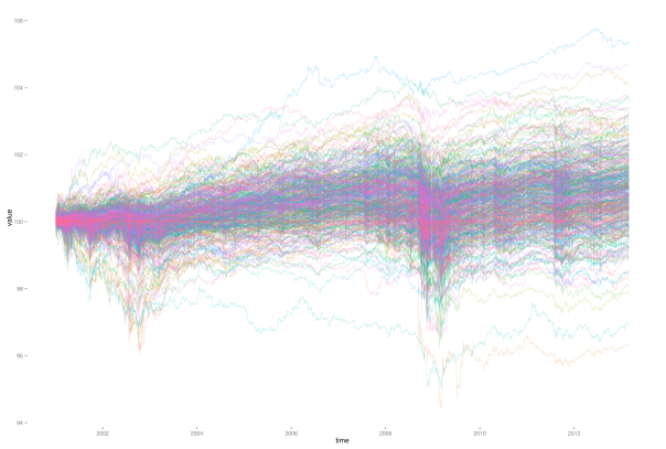
It is easy to run into situations, where labeling of graphics will fail due to the large number of components of the data. For example, when plotting a large number of stock price paths over time, labeling of individual paths will fail just due to the indistinguishability of individual path colors.
In situations like these we can gain a lot of information by providing interactivity to the graphic. With interactivity, one just needs to click on a given path of interest, and the corresponding company name, price and date will be displayed. So far I know about two great packages to enable interactivity in R graphics: googleVis and rCharts. googleVis provides an interface to access the powerful Google chart tools from within R. These charts are build on JavaScript, and can be easily embedded into any web page. The package comes with a vignette, and the author Marcus Gesmann provides some nice additional tutorials and instructions on his homepage. For some of the features you can even find tutorial videos on YouTube.
I haven’t looked too much into rCharts so far, but from the homepage we get that it is based on JavaScript as well. Hence, it seems like JavaScript is providing the richest framework for interactive graphics at present, with the most popular approaches to interactivity in R simply building interfaces to JavaScript. For a very nice example of what ultimately could be possible through interactivity in graphics, take a look at this comparison of stock market selection strategies.
Presentations in html
Sadly, creating interactive Java based graphics is only one part of the deal, as we have to face another hurdle when it comes to presentations containing such graphics. The problem is that pdf format – arguably the most common format for publications in science – does not (or only very badly) support interactive graphics. However, this is where the next enhancement comes into play: html based presentations. Meanwhile, html did catch up on two of the main requirements of the statistics related scientific community: vector graphics (through SVG) and mathematical formulas (through MathJax). Additionally, html slides also allow for text reflow, which provides much better user experience on mobile devices with small displays, as well as better embedding of media content such as interactive graphics, audio or video. If you want to see what I’m talking about, just take a short look at this example.
Now that you have seen some of the features possible with html, time for the next good news: it’s not even difficult. Dr. Ramnath Vaidyanathan, the author of rCharts, has developed another package, slidify, that let’s you easily create html slides directly from RStudio, with interactive graphics included and dynamic code blocks implemented through knitr. For further example presentations, take a look at this presentation listing some major advantages of slidify, or this presentation of a real statistical analysis presented with slidify.
However, slidify of course is not the remedy to all our problems. I haven’t tested this yet, but probably the pdf format could play more neatly with printing devices. Also, look and execution of some special features of your presentation still dependent on the actual browser used to view the slides. Using a current version of one of the main browsers (Firefox, Chrome or Internet Explorer), however, should rule out any bad surprises.
Interactive user applications
The last component that could be desirable for presenting results are standalone applications. Thereby, for example, the user could play around with different parameter settings, and hence develop a deeper understanding for a given topic, and a feeling for robustness and sensitivity of the results. Expanded with an appealing graphical user interface, such applications could also attract more interest and attention of students in academia.
One way to create such applications in R could be through usage of the package shiny, which can be used to deploy applications over the web. This way, users only need a web browser in order to be able to use the application, while the actual computation will be conducted on a server with R somewhere else. A similar approach is also followed by OpenCPU, which focuses on embedded statistical computation and reproducible research. Generally, such approaches can be used through two different strategies: either you set up your own Linux server hosting R, or you outsource the computations into the cloud, for example with Amazon web services. In order to get started, you can test your setup with a small scaled account at Amazon for free. A good tutorial on how to set up R with Amazon web services can be found here.
Putting the parts together
With rCharts and slidify, Dr. Ramnath Vaidyanathan not only created two of the main components for rich and interactive presentations. He also started the project “interactive learning environment” to get out the maximum learning experience, through nicely playing all the individual parts together. Take a look at this presentation, where he includes interactive R components in html slides, while simultaneously showing a recorded screencast of the slides, which is synced to the actual presentation.
Awesome!
Posted on 2013/09/07, in R and tagged Rbloggers, shiny, slidify. Bookmark the permalink. Leave a comment.

Leave a comment
Comments 0