Analyzing volatility patterns for SP500 stocks
Table of Contents
Now that we already have a cleaned high-dimensional stock return dataset at our hands, we want to use it in order to examine stock market volatility in a high-dimensional context. Thereby, we are searching for patterns in the joint evolution of individual stock volatilities. We have in mind the following goal: to reduce the high-dimensional set of individual volatilities to some low-dimensional common factors.
What we will find is that all of the assets’ volatilities seem to follow some common market trend of volatility. However, the variation explained through this market trend is about 50 percent only. Additionally, we find that, during each financial crisis, the one sector where the crisis originates will show levels of volatility above the market trend. Our sample contains two examples for this: the IT sector during the dot-com crash, and the financial sector during the financial crisis in 2008. However, based on findings of principal component analysis, there still is a large part of variation in volatilities that remains unexplained by common factors. This indicates that we should think about volatility as consisting of two parts: one part arising from common factors, and one part that is specific to the individual asset.
1 Motivation
In a portfolio context, individual asset volatility levels are probably still the most important risk factor, together with the components’ dependence structure. However, in large dimensional portfolios, it becomes extremely difficult to keep track of all of the individual volatility levels. Hence, if there was some pattern inherent in the joint evolution of volatilities, this could enable us to simplify risk management approaches through reduction of dimensionality. Whenever multiple stochastic variables show some common patterns, this is caused by dependency. And, given that this dependency is large enough, there is some redundancy in keeping track of all of the variables separately. A better way then would be to relate the components of the high-dimensional problem to some lower dimensional common factors.
So, why should there be any patterns in the joint evolution of individual volatilities? Well, as a first indication for this we can take financial crises, where usually almost every individual stock will exhibit an increased level of volatility. Slightly related to this, we later examine the explanatory power of shifts in mean market volatility. The justification for this is that usually market volatility indices react quite sensitive to financial crises, with index levels high above normal times. And, in turn, volatility indices show large dependency with mean market volatility levels. This way, mean market volatility can be seen as a proxy for financial crises.
When analyzing volatility, we are not dealing with a directly observable quantity. Hence, the first step of the analysis will be to derive some estimates for the individual asset volatility time paths. Of course, any shortcomings that we bring in at this step will directly influence the subsequent analysis. Nevertheless, we will refrain from overly sophisticated approaches for now, since we only want to get a feeling about the data first. Hence, we will derive estimates for individual stock volatilities simply by assuming a GARCH(1,1) process for each individual stock. If necessary, this assumption could easily be relaxed, and volatility paths could be estimated by different volatility models like EGARCH or some multi-dimensional extensions. Or, we could refrain from hard model assumptions, and simply estimate volatility with high-frequency data as realized volatility.
2 Estimation of volatility paths with GARCH(1,1)
As already explained, we first need to derive some estimates of the unobservable volatility evolutions over time. Hence, we will now estimate a GARCH(1,1) process with 
## clean workspace
rm(list=ls())

## load packages
library(zoo)
library(fGarch)

## read sp500 return data
z <- read.zoo(file = "data/all_sp500_clean_logRet.csv", header = T)
logRet <- coredata(z)

####################
## fit GARCH(1,1) ##
####################

## get dimensions
nAss <- length(logRet[1, ])
nObs <- length(logRet[, 1])

## preallocation
stdResid <- data.frame(matrix(data=NA, nrow=nObs, ncol=nAss))
vola <- data.frame(matrix(data=NA, nrow=nObs, ncol=nAss))

## fitting procedure
for (ii in 1:nAss) {
    ## display current iteration step
    print(ii)

    ## sometimes garchFit failed
    result <- try(gfit <- garchFit(data=logRet[, ii], cond.dist = "std"))
    if(class(result) == "try-error") {
        next
    }
    else {
        ## extract relevant information
        stdResid[, ii] <- gfit@residuals / gfit@sigma.t
        vola[, ii] <- gfit@sigma.t
    }
}

## label results
colnames(stdResid) <- colnames(logRet)
rownames(stdResid) <- index(z)
colnames(vola) <- colnames(logRet)
rownames(vola) <- index(z)

## round to five decimal places to reduce file size
stdResid <- round(stdResid, 5)
vola <- round(vola, 5)

##################
## data storage ##
##################

write.csv(stdResid, file = "data/standResid.csv", row.names=T)
write.csv(vola, file = "data/estimatedSigmas.csv", row.names=T)
3 Visualization of volatility paths
Now that we have an estimate for each asset’s volatility path, we want to get a first impression about the data through visualization. Therefore, we now will set up our workspace first, and load required data and packages.
######################
## set up workspace ##
######################

## load packages
library(zoo)
library(reshape)
library(ggplot2)
library(fitdistrplus)
library(gridExtra)
library(plyr)

## clean workspace
rm(list=ls())

## source multiplot function
source("rlib/multiplot.R")

## load cleaned logarithmic percentage returns as dataframe
logRetDf <- read.table(file = "data/all_sp500_clean_logRet.csv",
                       header = T)
names(logRetDf)[names(logRetDf) == "Index"] <- "time"

## get dimensions and dates
nObs <- nrow(logRetDf)
nAss <- ncol(logRetDf)-1
dates <- as.Date(logRetDf$time)

## load volatilities
volaDf <- read.csv(file = "data/estimatedSigmas.csv", header = T)
names(volaDf)[names(volaDf) == "X"] <- "time"
As first visualization, we now plot all volatility paths that where estimated with GARCH(1,1). Therefore, we define the function plotLinePaths, which we can reuse later on.
##############################################
## make multi-line plot of individual paths ##
##############################################

## plot multi-line path of df with column "time" or row.names
plotLinePaths <- function(data, alpha=0.2){
    "plot dataframe with or without time column"

    ## test for time column and rename if required
    if(any(colnames(data) == "time") | any(colnames(data) == "Time")){
        if(any(colnames(data) == "Time")){
            ## rename to lower case
            names(data)[names(data)=="Time"] <- "time"
        }
    }else{
        ## take row.names as x-index
        data$time <- row.names(data)
    }

    ## convert index to date format
    data$time <- as.Date(data$time)

    ## melt data to use ggplot
    dataMt <- melt(data, id.vars = "time")

    ## create plot
    p <- (ggplot(dataMt) +
          geom_line(aes(x=time, y=value, group=variable),
                    alpha = alpha))
}

## calculate mean volatility
volaOnly <- as.matrix(volaDf[, -1])
meanVola <- adply(volaOnly, .margins=1, .fun=mean)
colnames(meanVola) <- c("time", "value")
meanVola$time <- dates

plotOnly <- plotLinePaths(volaDf,0.2)

p1 <- plotOnly + xlab("time") +
    ylab("volatility")

p1 <- p1 + geom_line(mapping = aes(x=time, y=value),
                     data = meanVola,
                     color = "red")
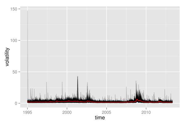
As can be seen, this graphics is not very enlightening, as the volatility paths remain in a very small interval at the bottom most of the time. Hence, we will immediately proceed by looking at logarithmic volatility paths, so that differences at the bottom will get shown in higher resolution.
#############################################
## plot log-transformation of volatilities ##
#############################################

logVola <- data.frame(time=dates, log(as.matrix(volaDf[, -1])))

p2 <- plotLinePaths(logVola, 0.2) + xlab("time") +
    ylab("logarithmic volatility") +
    geom_line(mapping = aes(x=time, y=log(value)), data = meanVola,
              color = "red")

p2
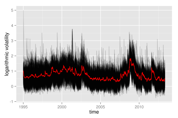
What appeared as one big black hose of nearly constant height before, now exhibits some shifts in its level over time. Clearly, times of crises do stand out from the plot: both in the aftermath of the dot-com bubble and during the financial crisis 2008, volatility paths were significantly above average levels. Even more remarkable is the fact that not only most volatility paths and their mean value are affected, but even the minimum of all volatility paths shifts significantly upwards. Hence, this is most likely not only a phenomenon that holds for most assets, but it really seems to affect all assets without exception.
Furthermore, we observe some noisy border at the top, where there are assets that individually enter high-volatility regimes in calm market periods as well. However, this also could be some artificial effect due to the estimation of volatilities with GARCH. Due to the structure of GARCH, a single large return of an asset will always automatically let its volatility estimate spike up. In contrast to the upper border, the lower border of all volatilities seems rather stable, without extreme outliers. This is at large due to the fact that volatility is bounded downwards by zero, and even the logarithmic transformation is not strong enough in order to fully compensate for this.
Still, however, even with logarithmic volatility paths, it is not possible to get more detailed insights into the individual evolutions, as they still overlap too much. This way, it is not possible to draw any conclusion of whether, for example, most paths are rather above the mean volatility, so that volatility levels would be asymmetrically distributed. Therefore, we now will take a look at the empirical quantiles of the volatilities, also. Again, we show them on normal scale, as well as on logarithmic scale.
#############################
## get empirical quantiles ##
#############################

## specify quantiles
alphas <- c(0, 0.05, 0.25, 0.5, 0.75, 0.95, 1)
nQs <- length(alphas)

## preallocation of empirical quantiles
quants <- data.frame(matrix(data=NA, nrow=nObs, ncol=nQs),
                     row.names=as.Date(dates))
names(quants) <- as.character(alphas)

## for each day get empirical quantiles
for (ii in 1:nObs) {
    quants[ii, ] <- quantile(volaDf[ii, -1], probs = alphas)
}

## process results for plotting
quantsDf <- data.frame(time=as.Date(dates), quants)
names(quantsDf) <- c("time", as.character(alphas))
logQuantsDf <- data.frame(time=as.Date(dates), log(quants))
names(logQuantsDf) <- c("time", as.character(alphas))

p3 <- plotLinePaths(quantsDf, 0.99) +
    ylab("quantiles of volatilities")

p4 <- plotLinePaths(logQuantsDf, 0.99) +
    ylab("quantiles of logarithmic volatilities")

p5 <- multiplot(p1, p2, p3, p4, cols=2)
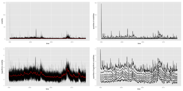
Besides the variation in height, the logarithmic quantiles look quite well-behaved and almost symmetric around the median. The symmetry only seems to fade out at the 5 and 95 percent quantiles. This could still be related to the fact that volatility, on a normal scale, is bounded from below by zero, while it is unbounded from above.
Again, the shift in height due to crises periods also becomes apparent for the empirical quantiles, and again it looks like all quantiles are affected similarly. Looking at this picture, one might be tempted to conclude that all individual volatility paths strongly follow some overall market volatility, which is represented through the median in this case. However, this conclusion is premature at this point. Even if we can get a quite good guess about the overall distribution of volatilities once we know the market volatility, it is still unsure how much this will tell us about any individual stock. We will further clarify what is meant by this in some later part.
For now, we first want to look at an at least somewhat finer resolution than the complete overall distribution of all assets. Therefore, we will split up individual assets into groups. This way, we decrease overlap of volatility paths, as the total number of paths becomes significantly lower. Hence, patterns and changes will become better visible. The division into groups that we will apply here shall follow the classification of assets provided by sector affiliation. Hence, for each of the remaining assets in our SP500 dataset, we need to determine its sector. Usually, you can access this information from any big proprietary data provider. Here, we will rely on the classification provided by Standard & Poor’s, where you can download a list of constituents for almost all sector indices. I already brought this information together in a csv file, where each of the remaining assets of our dataset is listed together with its sector. However, by the time of writing, Standard & Poor’s did not provide lists of constituents for sectors materials, telecommunication services and utilities. Hence, in the csv file, any asset that was not mentioned in one of the other sectors simply bears the label “matTelUtil”.
In order to plot volatility paths for the individual sectoral subgroups, we need to calculate the mean value of each subgroup for each day of our sample period. This task exactly matches the split-apply-combine procedure that Hadley Wickham describes in [Wickham], and that he implemented in the plyr package. Using this package, we now can easily split the data into subgroups determined by date and sector, and apply the meanValue function to each group.
## refine volatility for incorporation of sectors
volaMt <- melt(volaDf, id.vars="time")
names(volaMt) <- c("time", "symbol", "value")

## load sectors
sectors <- read.table(file="data/sectorAffiliation.csv", header=T)

## merge
volaSectorsMt <- merge(volaMt, sectors, by="symbol")
volaSectors <- volaSectorsMt[names(volaSectorsMt) != "symbol"]

## define function to get mean on each subgroup
meanValue <- function(data){
    meanValue <- mean(data$value)
}

## for each day and sector, get mean volatility
sectorVola <- ddply(.data=volaSectors,
                    .variables=c("time", "sector"), .fun=meanValue)
sectorVola$time <- as.Date(sectorVola$time)

p <- ggplot(sectorVola) + geom_line(aes(x=time, y=V1, color=sector))
p
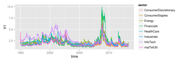
As we can see, at large, all sectors follow some joint market volatility evolution. However, there exist some slight differences over time. From 1995 until 2005, the information technology sector did exhibit the highest volatility of all sectors, while its volatility level is rather average afterwards. Then, in 2005, the energy sector temporarily becomes the sector with highest volatility, before it gets replaced again by the financial sector in 2008. Remarkably, although the financial sector exhibits large volatility in the last third of the sample, its volatility level did reside near the bottom of all sector volatilities for more than the first half. Hence, there clearly is some further variation in volatility levels besides the variation that is caused through up- and downwards shifting market volatility. The relative position of individual sectors changes over time: sectors that where beneath the market volatility in the first half, suddenly show higher levels than average in the second half. Whether this influences the explanatory power of the mean market volatility is what we want to see in the next part.
4 Explanatory power of shifting mean
So far, we have seen that there is some large variation in the level of stock volatilities during periods of market turmoil. In these periods, not only the average market volatility increases, but even the minimum of all volatilities increases. Hence, knowledge of the market volatility clearly reveals some information about the current distribution of volatilities. However, the market volatility might still reveal very little information about any given single volatility.
Let’s just assume for a second, that individual logarithmic volatilities are normally distributed around the market volatility. Then, with knowledge of the market volatility, you also know the overall distribution. However, without any further assumptions, you still do not know anything about the individual volatilities within this distribution. Any given single stock still could be anywhere around the mean, provided that it follows the probabilities determined by the normal distribution. You only know that it will be within a range with a given probability, but you still can not predict whether it is above or below the mean. Hence, without further structure, the market volatility might still be a bad estimator for any given single volatility.
However, through imposing some additional structure, one could easily extend this example into a system, where the mean of the normal distribution tells you a lot about the individual stocks as well. Let’s now additionally assume that the individual volatilities follow some ranking. Hence, the volatility of some stock A now will always be larger than the volatility of some stock B. Suddenly, we now will be able to pin down the exact location of any individual volatility very accurately. Let’s just convince ourselves of this effect with a little simulated example.
For that, we will artificially create a first increasing and then decreasing sequence of (logarithmic) market volatility levels. This can be achieved by letting the market volatility follow the first half of a sine oscillation. From this course of oscillation, we extract 100 points in time. Then, for each of the 100 points, we simulate 30 values of a normal distribution with mean value given by the market volatility sequence. This already represents the first case, where only the overall distribution is affected by the market volatility, but where still a large variation of the individual volatilities around the mean exists.
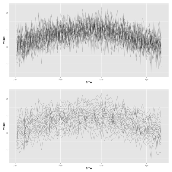
Then, for the second case, we now impose the additional requirement that individual volatilities follow a certain ranking. In order to achieve this, we simply need to sort all the simulated observations at a given point in time. Thereby, we make use of the plyr package, so that we can easily apply the sort function to each of the 100 rows of the matrix of simulated values. We then make use again of the plotLinePaths function in order to plot the resulting 30 simulated volatility paths for both cases. Clearly, the second case imposes much more structure on the evolution of joint volatilities.
library("plyr")

## init sample size and assets
nObs <- 100
nAss <- 30

## create increasing and decreasing market mean sequence
mus <- sin(1:nObs/(nObs/pi))

## specify standard deviation
sigma <- 0.5

## define simulation function
simulateForGivenMean <- function(mu){
    rnorm(n=nAss, mean=mu, sd=sigma)
}

## simulate for each mu values: individual assets in columns
simVals <- t(sapply(mus, simulateForGivenMean))
simValsDf <- data.frame(time = 1:nObs, simVals)

## for each day, sort simulated values
simValsSorted <- aaply(.data = simVals, .margins=1, .fun=sort)
simValsSortedDf <- data.frame(time = 1:nObs, simValsSorted)

p1 <- plotLinePaths(simValsDf)

p2 <- plotLinePaths(simValsSortedDf)
p3 <- multiplot(p1, p2, cols=1)
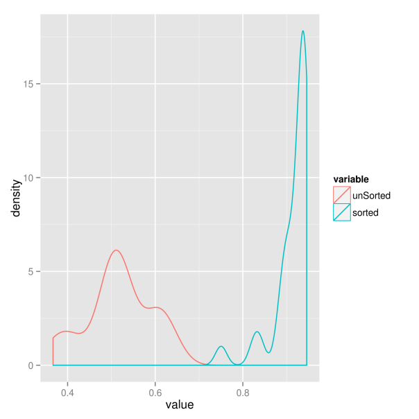
For the sake of completeness, we now additionally want to examine whether this increased structure really results in higher predictive power of the market volatility. Therefore, we extract the sample correlation between each of the simulated individual volatility paths and the market volatility. Hence, for each of the two market situations we get 30 correlations, which we compare in a kernel density plot. Clearly, the situation where volatility paths are sorted results in larger correlations. The market volatility thus will have greater explanatory power in this case.
########################################
## get correlations with market trend ##
########################################

corrs <- vector(length = nAss)
for(ii in 1:nAss){
    corrs[ii] <- cor(simVals[, ii], mus)
}

corrsSorted <- vector(length = nAss)
for(ii in 1:nAss){
    corrsSorted[ii] <- cor(simValsSorted[, ii], mus)
}

corrsDf <- data.frame(index = 1:nAss, unSorted = corrs,
                      sorted = corrsSorted)
corrsMt <- melt(corrsDf, id.vars = "index")

p <- ggplot(corrsMt) + geom_density(aes(x=value, color=variable))
p
So which of the two situations is closer to the behavior of real world markets? We will try to find out in the next part.
5 Principal component analysis
We now want to add some quantitative rigor to the qualitative analysis of the preceding parts. So far, we have narrowed our focus down to financial crises and market volatility as common underlying factors of the evolution of stock market volatilities. The reason for this is twofold. First, the relation with these factors became obvious in the first pictures of joint volatility paths. And second, they have the big advantage of being nicely interpretable. However, with the help of quantitative methods, we now have the chance to extend our search of common factors to uninterpretable factors also. Interpretable factors would only be the best case that we could hope for, and even unobservable and uninterpretable factors would be welcome in risk and asset management applications. Hence, we will now use a more general approach to check volatility paths for commonalities. And, as we will see, the market volatility will play a big role here again.
Without going too much into details, you can think of principal component analysis as a technique that tries to explain the variation of a high-dimensional dataset as efficient as possible. Therefore, you construct synthetic and uncorrelated factors (called principal components) from the original data sample. Each component is a linear combination of the original variables of the dataset. The components are calculated successively, and in each step you choose the orthogonal linear combination that explains as much of the remaining variation as possible. This way, the individual principal components will show decreasing proportions of variation that they explain. Ideally, you will end up with a situation, where most of the variation of the high-dimensional data is already explained through a small number of principal components.
For the computation of the principal components we can simply rely on the implementation of the base R package “stats”. Then, in order to see how much the high-dimensional setting boils down to some factors only, we plot the cumulated variation explained by the first components.
## get volatilities without time for PCA analysis
volaNoTime <- volaDf[, -1]

## get first two principal components
PCAresults <- princomp(x=volaNoTime)
PC1 <- PCAresults$scores[, 1]
PC2 <- PCAresults$scores[, 2]

## get cumulative proportion of variance
explainedByPCA <- summary(PCAresults)
props <- explainedByPCA$sdev^2 / sum(explainedByPCA$sdev^2)

## plot proportions of first k values
k <- 10
propsDf <- data.frame(PC=1:k, proportion=props[1:k],
                      cumulated=cumsum(props[1:k]))
propsMt <- melt(propsDf, id.vars = "PC")
p <- ggplot(propsMt, aes(x=factor(PC), y=value, fill=variable)) +
    geom_bar(position="dodge") +
    xlab("Principal Components") + ylab("proportion of variance")
p
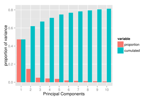
As the picture shows, the first component already explains roughly 50 percent of the total variation of the data. However, the explanatory power of the following components decreases substantially, with the second component already explaining only 15 percent of the variation. Subsequently, the next three components explain roughly 5 percent each. From the sixth component onwards the explanatory power is already so low that they probably capture already very specific variation that concerns a few assets only. And, even with 10 components, we hardly exceed a variation of 80 percent.
Hence, it looks like if the evolution of volatility paths was driven by too many different factors to be efficiently reduced to a low-dimensional system. One way we could think about this is that asset volatilities roughly do follow one, two or maybe even five common factors. However, at any point in time, there also will be a substantial number of assets that temporarily follow some individual dynamics, deviating from the larger trend. For example, even if the common factors indicate a calm market period, there still will be assets that individually exhibit stressed behavior and high volatility. Or, following a more traditional way of thinking, the evolution of a given asset is driven by two different factors: a common market factor, and an idiosyncratic, firm specific component. Sadly, the idiosyncratic components seem too large to be neglected.
Nevertheless, even though it is clear that we will not achieve the dimensionality reduction that we where striving for, we will now take a more detailed look at the first components. Maybe we can at least give them some meaningful interpretation, so that we get a feeling about when we have to expect a high average market volatility.
The first thing to do is to look at the evolution of the first two principal components. Thereby, we want to plot the path of each principal component individually, as well as the path that they follow when considered together. As ggplot does not support three-dimensional graphics yet, we will express the third dimension, time, through colors. To simplify matters, we do only map numerical indices to the color axes, instead of real dates. However, you can still read off the date-color mapping from the respective one-dimensional paths of the individual components. For reasons that will become obvious in subsequent parts, we also plot the first component with negative sign.
## scatterplot of first two PCs: first one with negative sign
pCs <- data.frame(time=1:nObs, cbind(PC1, PC2))
pCsMt <- melt(pCs, id.vars=c("PC1","PC2"))

p1 <- ggplot(pCsMt, aes(x=-PC1, y=PC2), colour=value) +
    geom_point(aes(colour=value))

## plot individual time series PC1 and PC2
pC3 <- data.frame(time=as.Date(dates), time2=1:nObs, -PC1, PC2)
names(pC3) <- c("time", "time2", "-PC1", "PC2")
pC3Mt <- melt(pC3, id.vars=c("time", "time2"))

## plot individual time series PC1 and PC2
p4 <- ggplot(pC3Mt, aes(x=time, y=value)) +
    geom_path(aes(colour=time2)) + facet_grid( variable ~ .)

grid.arrange(p1, p4, ncol=2)
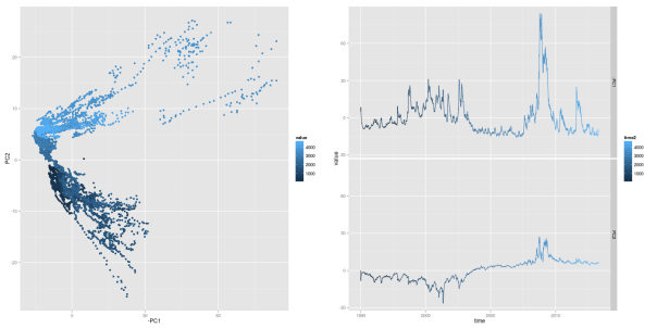
Looking at the first principal component, one should already recognize some familiar pattern: it’s peaks coincide with financial crises. As we will show later, this first principal component has an exceptional high correspondence with the market volatility. We can recognize crisis periods also in the path of the second principal component. Here, the component takes on extreme values during both financial crises, too. However, the values differ in sign for the two crises periods: the component shows negative values in the aftermath of the dot-com bubble, while it takes on positive values during the financial crisis of 2008. Hence, when considering both components together, crisis periods can be found in the upper right and lower right corners of a two-dimensional space of both components.
As the first component’s sensitivity to financial crises is equally strong as the market volatility’s sensitivity, they both should also exhibit some mutual relationship. Hence, we now want to examine the strength of the similarity between first component and market volatility. Thereby, we simply use mean and median of all volatility paths as a proxy for the market volatility. Additionally, we also allow the principal component to be linearly transformed (shifted and rescaled) to better match the path of the market volatility. We regress each market volatility proxy on the first component, in order to get a best linear transformation. Afterwards, we choose the market volatility proxy with the largest 
In order to get mean volatility and median for each given date, we again use the plyr package of Hadley Wickham. This way, we can easily split the data into subsets, and then apply a function to each part.
library("plyr")

## load volatilities
volaDf <- read.csv(file = "data/estimatedSigmas.csv", header = T)
names(volaDf)[names(volaDf) == "X"] <- "time"
volaNoTime <- volaDf[, -1]

## get first two principal components
PCAresults <- princomp(x=volaNoTime)
PC1 <- PCAresults$scores[, 1]
PC2 <- PCAresults$scores[, 2]

## get mean of volatilities as market volatility proxy
volaMatrix <- as.matrix(volaDf[, -1])
marketVola <- aaply(volaMatrix, .margins=1, .fun=mean)
marketMedian <- aaply(volaMatrix, .margins=1, .fun=median)

## apply linear rescaling according to regression coefficients
fit <- lm(marketVola ~ PC1)
fit2 <- lm(marketMedian ~ PC1)

## get r squared for both mean and median
rSquared1 <- summary(fit)$r.squared
rSquared2 <- summary(fit2)$r.squared

(sprintf("R^2 for mean=%s, R^2 for median=%s",
         round(rSquared1, 3), round(rSquared2, 3)))

pC1MarketVolaDf <- data.frame(time=dates,
                              rescaled_PC1=fit$fitted.values,
                              marketVola=marketVola)

pC1MarketVolaMt <- melt(pC1MarketVolaDf, id.vars="time")
p1 <- ggplot(pC1MarketVolaMt, aes(x=time, y=value, colour=variable)) +
    geom_line()
[1] "R^2 for mean=0.983, R^2 for median=0.966"
Comparing the
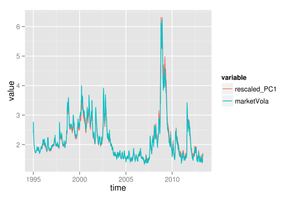
As the first principal component nearly exactly matches the market volatility, we can relate its properties to the market volatility. Hence, we now can conclude that roughly 50 percent of the variation of individual asset volatilities is explained through a general market volatility level. The rest of the variation thus arises from fluctuations around the mean, and we will try to find some explanation for this, too. First, however, we want to find out how the influence of the market volatility exactly affects the individual assets. Therefore, we need to take a more detailed look at the factor loadings, which will be distinguished according to sectoral affiliation again. As with the principal component itself, we also change the sign of its loadings, so that the graphics will be consistent, and the component becomes directly interpretable as market volatility.
While the first plot shows a histogram of the loadings in absolute terms, the second plot shows relative proportions for the individual sectors.
## get loadings for first component
loadings1 <- PCAresults$loadings[, 1]
loadDf1 <- data.frame(symbol=names(loadings1), loadings=loadings1)

## load sectors
sectors <- read.table(file="data/sectorAffiliation.csv", header=T)
loadSectorDf <- merge(loadDf1, sectors, by="symbol")

## adjust bin size to 20 bins
binw <- diff(range(loadSectorDf$loadings))/10

## colorize according to sector
p1 <- ggplot(loadSectorDf, aes(x=-loadings, fill=sector)) +
    geom_histogram(binwidth=binw) +
    xlab("loadings of 1st principal component")
p2 <- ggplot(loadSectorDf, aes(x=-loadings, fill=sector)) +
    geom_bar(position="fill", binwidth=binw) +
    xlab("loadings of 1st principal component")

multiplot(p1, p2, cols=1)
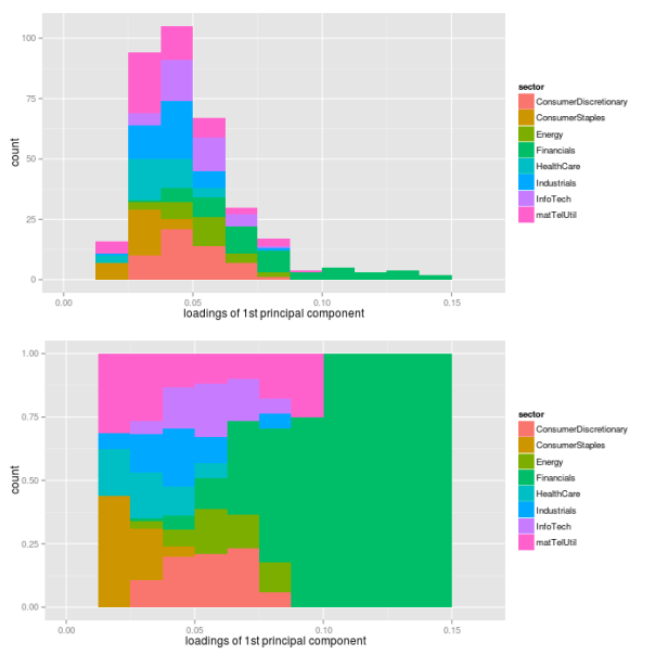
The most important point here certainly is the fact that all individual assets have a positive loading for the first component. Hence, each single asset follows the variations of the market volatility. Thereby, companies from the financial sector have loadings that are larger than average, while sectors consumer staples, health care and industrials are below average. Still, this does not directly translate into the strength of the market volatility’s influence on individual sectors. To measure this strength, we additionally regress each asset’s volatility path on the path of the first principal component, and extract the values of
## preallocation
rSquared1 <- vector(mode="logical", length=nAss)

## regress each volatility on the first principal component
for(ii in 1:nAss){
    dataDf <- data.frame(y=volaDf[, ii+1], x=PC1)
    lmFit <- lm(y~x, data=dataDf)
    temp <- summary(lmFit)
    rSquared1[ii] <- temp$r.squared
}

## plot R^2
rSquaredDf1 <- data.frame(symbol=row.names(PCAresults$loadings),
                          rSquared=rSquared1)
rSquaredSectors <- merge(rSquaredDf1, sectors, sort=F)

## adjust bin size to 10 bins
binw <- diff(range(rSquared1))/10

## colorize according to sector
p1 <- ggplot(rSquaredSectors, aes(x=rSquared, fill=sector)) +
    geom_histogram(binwidth=binw) +
    xlab("R squared for individual assets and PC1")
p2 <- ggplot(rSquaredSectors, aes(x=rSquared, fill=sector)) +
    geom_bar(position="fill", binwidth=binw) +
    xlab("R squared for individual assets and PC1")

multiplot(p1, p2, cols=1)
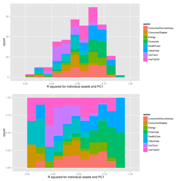
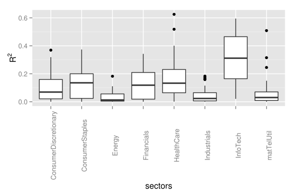
As we can see, the values of
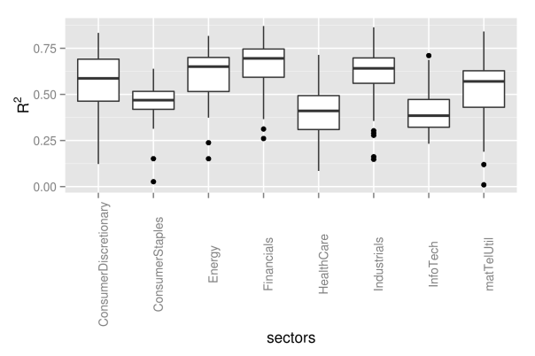
## preallocation
rSquared1 <- vector(mode="logical", length=nAss)

## regress each volatility on the first principal component
for(ii in 1:nAss){
    dataDf <- data.frame(y=volaDf[, ii+1], x=PC1)
    lmFit <- lm(y~x, data=dataDf)
    temp <- summary(lmFit)
    rSquared1[ii] <- temp$r.squared
}

## plot R^2
rSquaredDf1 <- data.frame(symbol=row.names(PCAresults$loadings),
                          rSquared=rSquared1)
rSquaredSectors <- merge(rSquaredDf1, sectors, sort=F)

## boxplot
p <- ggplot(rSquaredSectors) +
    geom_boxplot(aes(x=sector, y=rSquared)) +
    xlab("sectors") + theme(axis.text.x=element_text(angle=90)) +
    ylab(expression(R^{2}))
p
As next step, we now want to find some interpretation for the second component as well. However, the path of the second component did not immediately suggest any easy interpretation, so that we now will need to take a look at the loadings first.
## get loadings for first component
loadings2 <- PCAresults$loadings[, 2]
loadDf2 <- data.frame(symbol=names(loadings2), loadings=loadings2)

## load sectors
sectors <- read.table(file="data/sectorAffiliation.csv", header=T)
loadSectorDf <- merge(loadDf2, sectors, by="symbol")

## plot histogram of negative loadings
p <- ggplot(loadSectorDf) + geom_histogram(aes(x=-loadings,
                                               fill=sector))

## adjust bin size to 20 bins
binw <- diff(range(loadSectorDf$loadings))/10

## colorize according to sector
p1 <- ggplot(loadSectorDf, aes(x=loadings, fill=sector)) +
    geom_histogram(binwidth=binw) +
    xlab("loadings of 2nd principal component")
p2 <- ggplot(loadSectorDf, aes(x=loadings, fill=sector)) +
    geom_bar(position="fill", binwidth=binw) +
    xlab("loadings of 2nd principal component")

multiplot(p1, p2, cols=1)
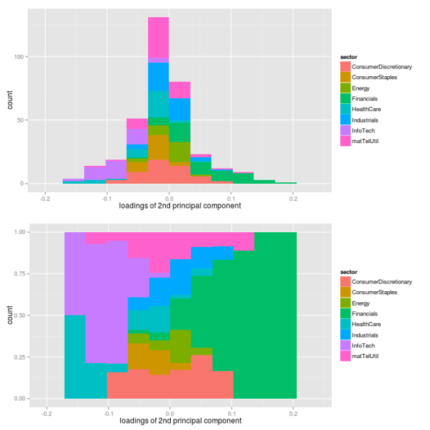
As it turns out, the loadings of the assets are almost fairly cut in halves with respect to their sign: approximately one half of the loadings has a positive sign, while the other half has a negative sign. However, this fair split does not hold for individual sectors. While financial companies nearly show a positive loading exclusively, companies from health care and information technology sectors have negative signs only. Hence, the second component picks up differences in volatility between these sectors. Let’s see, what these different signs of the loadings will actually mean for the volatilities of the sectors. Therefore, we need to look at loadings and the path of the second component simultaneously.
## evolution 2nd factor
PC2df <- data.frame(time=dates, PC2=PC2)
p2 <- ggplot(PC2df, aes(x=time, y=PC2)) + geom_line()
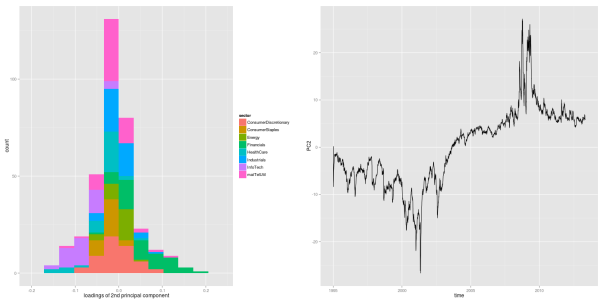
As we can see from the figure, the second principal component takes on negative values constantly for roughly the first half of the sample period, before it shifts into positive numbers until the end of the sample. Due to the loadings, a negative second component coincides with decreased volatility levels for the financial sector, and increased levels for health care and information technology sectors. This effect becomes even more pronounced during financial crises, where the component takes on its most extreme values.
In other words, the first component corresponds to the level of the market volatility, and it shifts the overall distribution of asset volatilities up and down. The second component, however, only captures changes within a given distribution. For the first half of the sample, it adds some extra volatility on the information technology sector, while it decreases the volatility of the financial sector. In the second half, it is the other way round.
To further clarify the role of the second component, we create another simulated example as visualization of this effect.
## simulate points from normal distribution
nSim <- 20
mu <- 0
xx <- rnorm(nSim, mu, 1)

## points below the mean value are listed as group1
indSign <- factor(xx<mu, levels=c("TRUE", "FALSE"),
                  labels=c("group1", "group2"))

## append points with changed sign - groups affiliation unchanged
xxDf <- data.frame(vals=c(xx,-xx),
                   time=factor(c(rep(1, nSim), rep(2, nSim)),
                       levels=c(1, 2),
                       labels=c("positive factor", "negative factor")),
                   group=rep(indSign, 2), y=rep(0,(2*nSim)))

## show points for different realizations of factor
p <- ggplot(xxDf, aes(x=vals, y=y, color=group)) + geom_point() +
    facet_grid(time ~ .) + stat_function(fun=dnorm, color="black") +
    scale_x_continuous(limits = c(-5, 5)) +
    labs(title="variation explained by PC2")
p
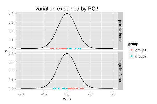
The figure shall convey the following intuition: the realization of the second component does not change the overall distribution, but it only explains variation within the distribution. Hence, for positive values, the first group of points will be located to the left, while they are located to the right for negative realizations.
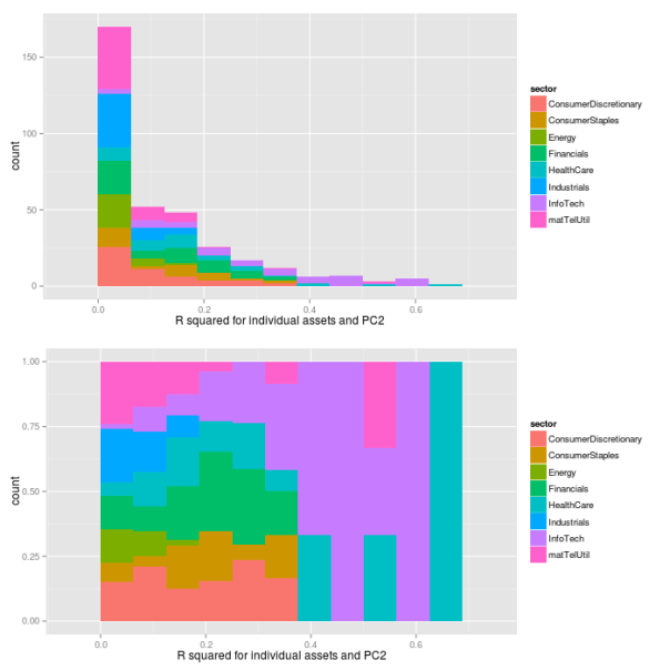
As with the first component, we now want to see how the loadings translate into real influence. Therefore, we regress each asset’s volatility path on the path of the second component, and extract the
## preallocation
rSquared2 <- vector(mode="logical", length=nAss)

## regress each volatility on the first principal component
for(ii in 1:nAss){
    dataDf <- data.frame(y=volaDf[, ii+1], x=PC2)
    lmFit <- lm(y~x, data=dataDf)
    temp <- summary(lmFit)
    rSquared2[ii] <- temp$r.squared
}

## plot R^2
rSquaredDf2 <- data.frame(symbol=row.names(PCAresults$loadings),
                          rSquared=rSquared2)
rSquaredSectors <- merge(rSquaredDf2, sectors, sort=F)

## adjust bin size to 10 bins
binw <- diff(range(rSquared2))/10

## colorize according to sector
p1 <- ggplot(rSquaredSectors, aes(x=rSquared, fill=sector)) +
    geom_histogram(binwidth=binw) +
    xlab("R squared for individual assets and PC2")
p2 <- ggplot(rSquaredSectors, aes(x=rSquared, fill=sector)) +
    geom_bar(position="fill", binwidth=binw) +
    xlab("R squared for individual assets and PC2")

multiplot(p1, p2, cols=1)
## preallocation
rSquared2 <- vector(mode="logical", length=nAss)

## regress each volatility on the first principal component
for(ii in 1:nAss){
    dataDf <- data.frame(y=volaDf[, ii+1], x=PC2)
    lmFit <- lm(y~x, data=dataDf)
    temp <- summary(lmFit)
    rSquared2[ii] <- temp$r.squared
}

## plot R^2
rSquaredDf2 <- data.frame(symbol=row.names(PCAresults$loadings),
                          rSquared=rSquared2)
rSquaredSectors <- merge(rSquaredDf2, sectors, sort=F)

## boxplot
p <- ggplot(rSquaredSectors) +
    geom_boxplot(aes(x=sector, y=rSquared)) +
    xlab("sectors") + theme(axis.text.x=element_text(angle=90)) +
    ylab(expression(R^{2}))
p
As we can see from the pictures, the influence of the second component measured by the
Now let’s try to embed these quantitative findings into a more qualitative perception that we have of the sample period, and think about their relevance for practical applications. First, the quantitative findings do match very well with the respective origins of the crises periods. During the dot-com crash, which was labeled after its origin in the IT sector, our quantitative findings also do show some enlarged volatility levels of the same sector. And, for the financial crisis of 2008, the second component assigns a higher volatility level to the financial sector, while the IT sector simply follows some more general market conditions.
6 Conclusion
How much should we rely on these findings when trying to assess future risks? Well, in my opinion, we probably should focus rather on the larger patterns pointed out by the analysis, instead of sticking too much with the details. For example, although the second component captures differences between both crises very appropriately, I would not bet too much on its predictive power in future. The point is, it overfits the exact origin of the crises, such that it mainly distinguishes between IT and financial sector. However, I’d rather focus on the bigger story that this component tells: crises may originate in one sector, which then will exhibit volatility levels above the general market trend. Nevertheless, the exact sector, where the next crisis will originate, could be any. Our data simply did contain only crises that were caused by IT and financial sector.
Another pattern that seems rather robust to me is the variation captured by the first principal component. Hence, the general market volatility is not constant over time, but it increases during crises periods. And these shifts in market volatility seem to affect many, if not all, individual assets. Besides, however, at each point in time, some individual assets will always deviate from the larger trend of volatility. Hence, there must be some idiosyncratic component to volatility, too.
References
| [Wickham(2011)] | Hadley Wickham. The split-apply-combine strategy for data analysis. Journal of Statistical Software, 400 (1):0 1-29, 4 2011. ISSN 1548-7660. URL http://www.jstatsoft.org/v40/i01. |
Posted on 2013/10/23, in financial econometrics, R and tagged PCA, Rbloggers, sp500, volatility. Bookmark the permalink. 5 Comments.

looks nice with ggplot2. like u post above, i will reproduce ur code, so be carefull :-)
did u hear a package called rmysql. i used it links r and mysql databank. it means now i have my own databank . such as i may update sp500 info. from google, yahoo, usw. everyday. and then calculating their mean value for my databank. after 10 years i can also sell my datas. a linke maybe useful http://www.ninggg.net/?page_id=487
I sincerely hope that you will try to reproduce the code – that’s the whole point about making it publicly available! And if you find any problems, please let me know.
When you have a clean dataset sometime in the future, you hopefully will offer me a large discount? ;-)
try my best
if it is necessary, i would like to say at second line of section 2 “hence, we will now estimate a GARCH(1,1) process..” with additional comments such as “GARCH(1,1) with a Stuednt t-distribued innovation precess” for each… as in coding below u use grachFit() with cond.dist=”std”. Another note as u said garchFit failed sometimes, if u add a extra argument: “trace=F”, may be useful
thanks, fixed it!